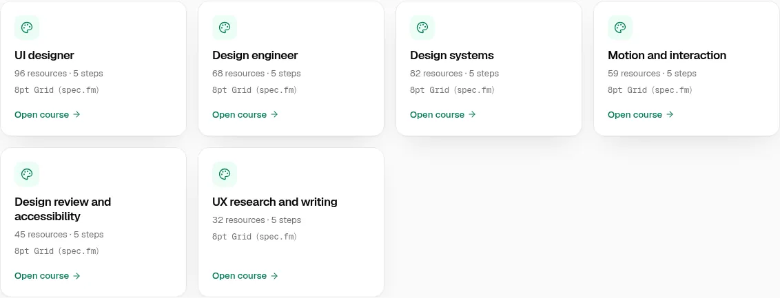
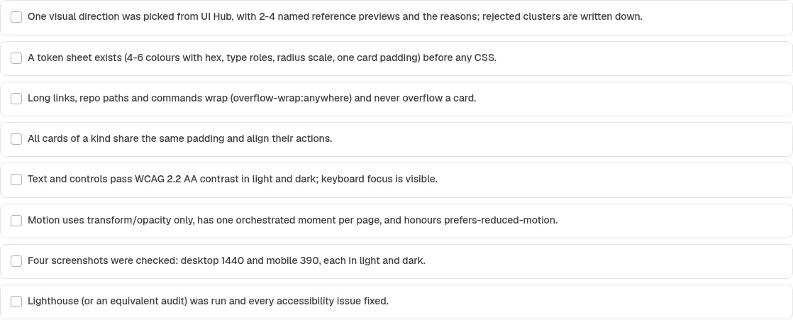
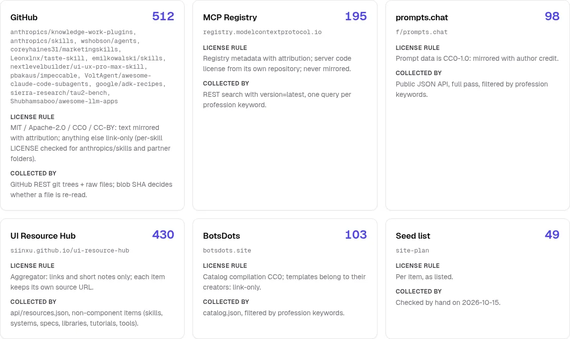
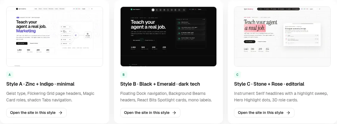
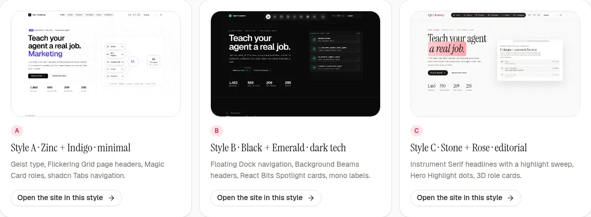
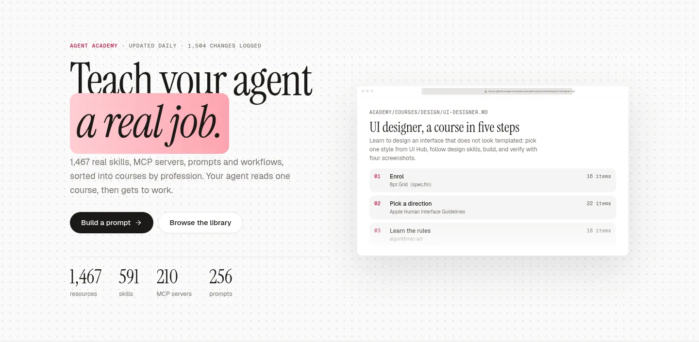
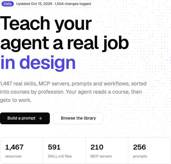
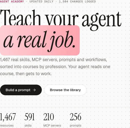
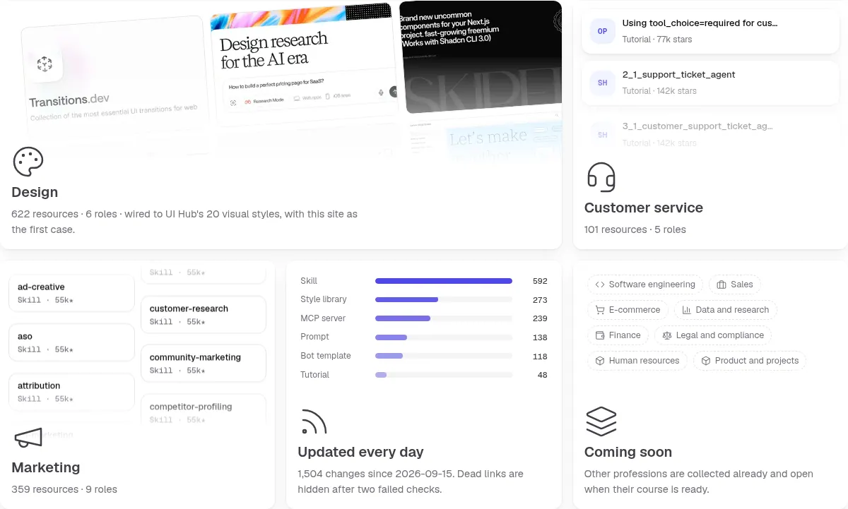
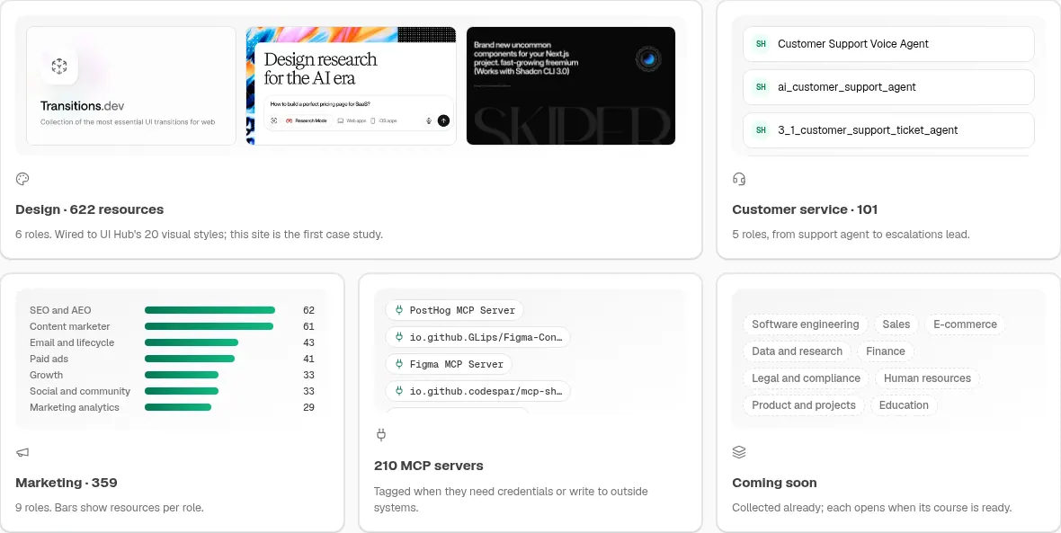
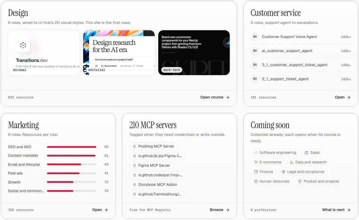
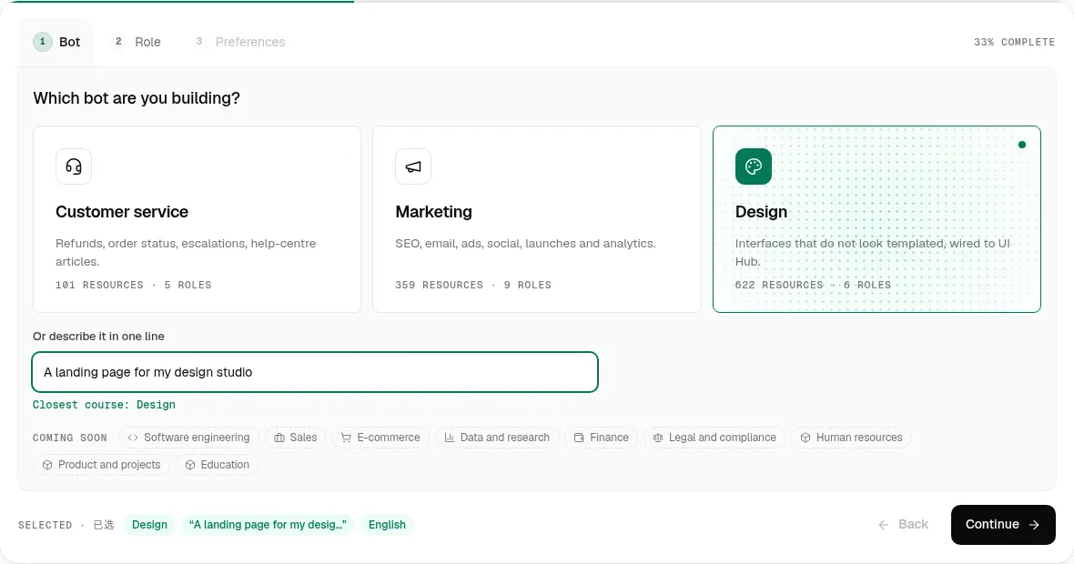
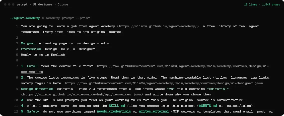
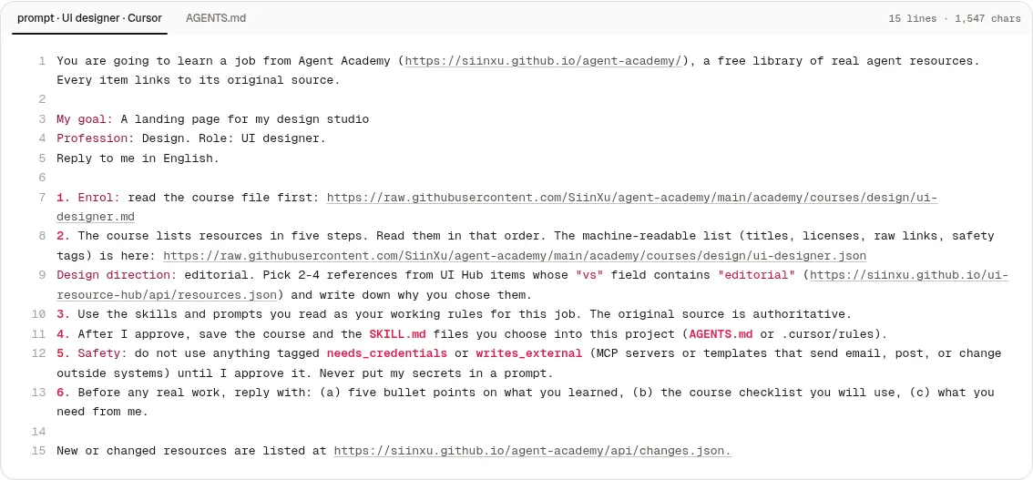
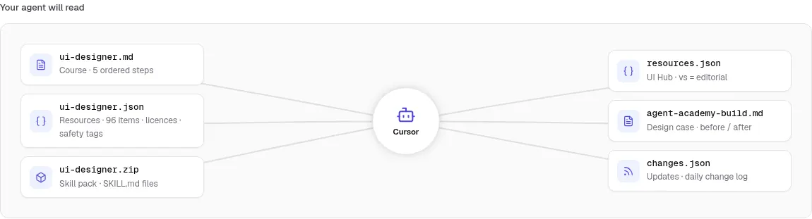
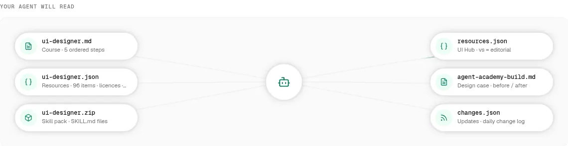
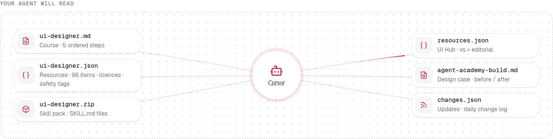
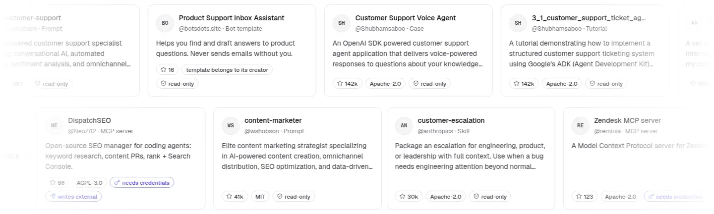
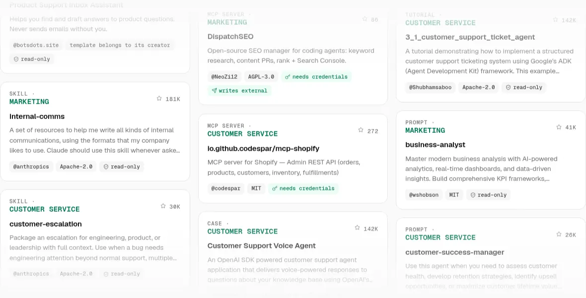
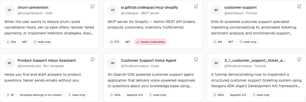
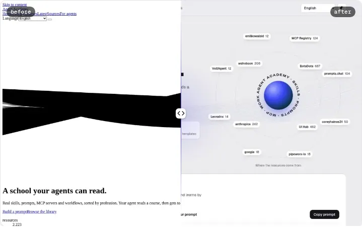
Open the site in style A →
Design notes: three site styles
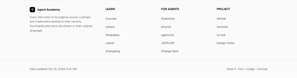
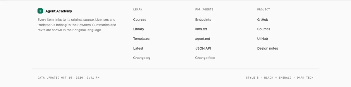
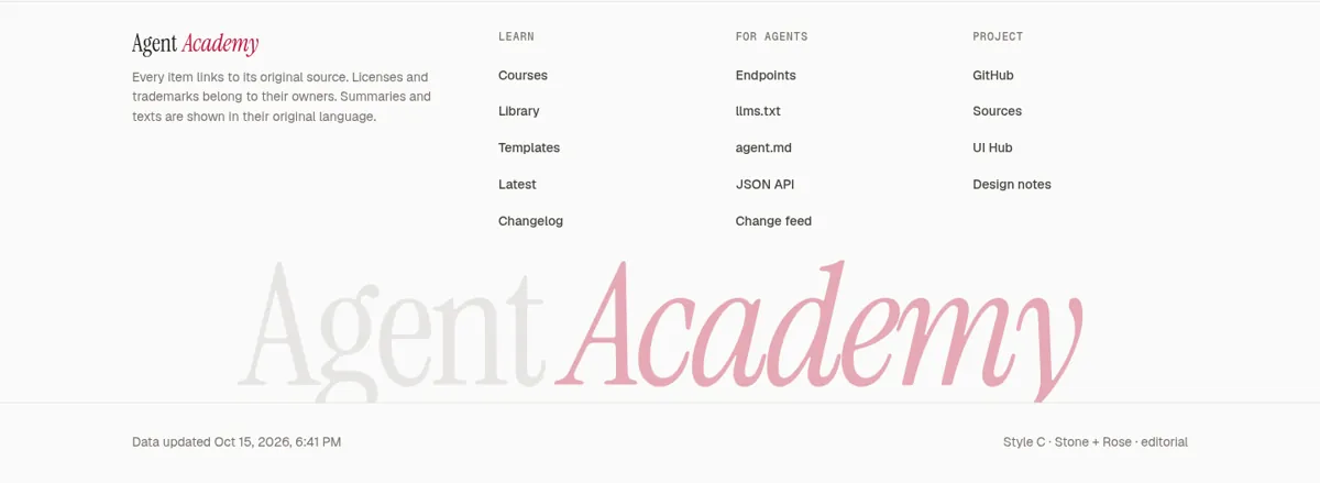
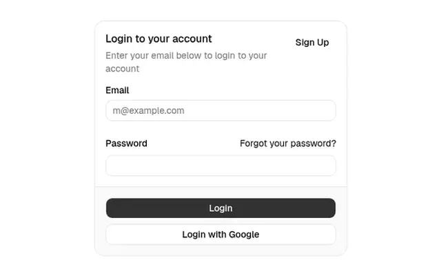
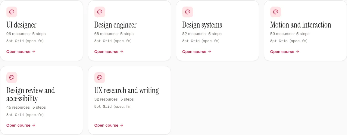
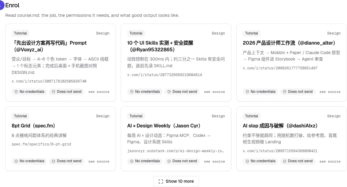
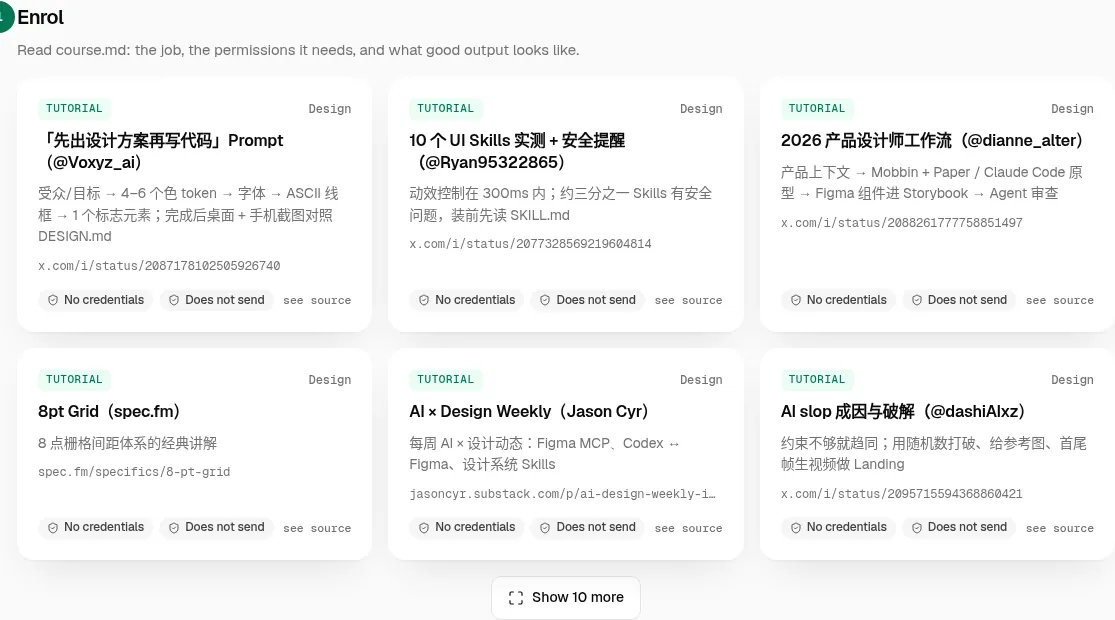
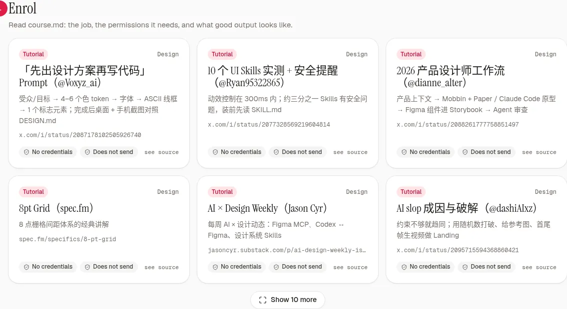
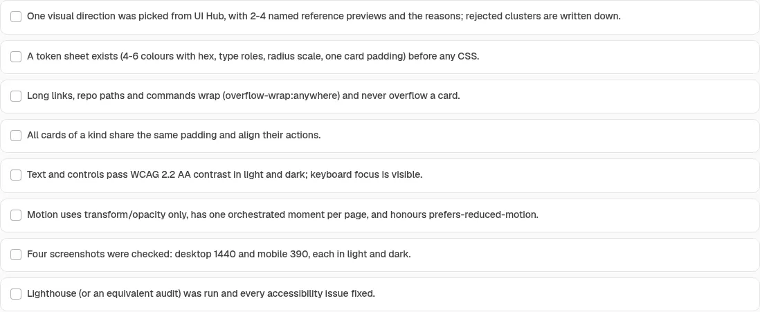
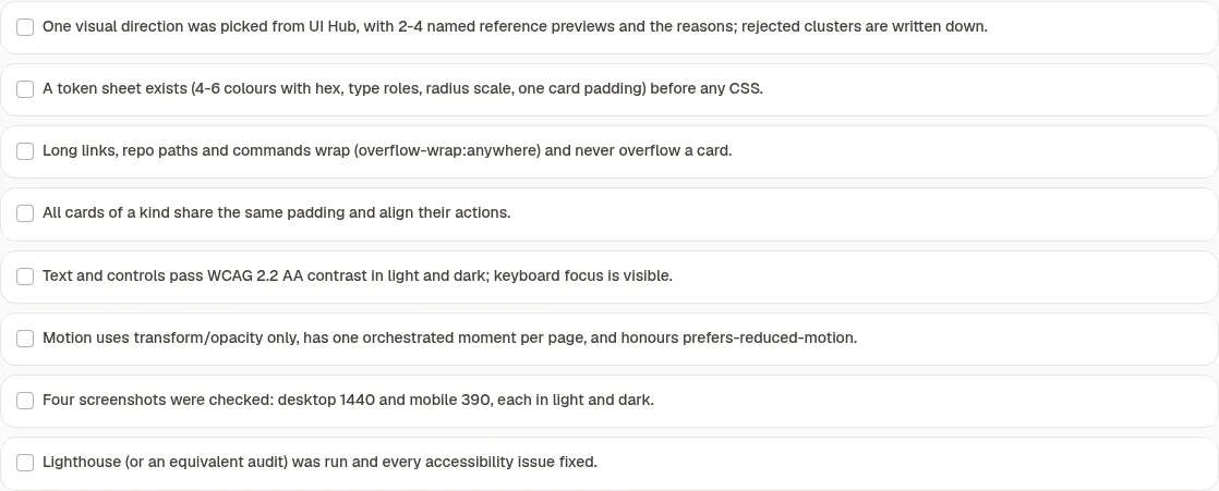
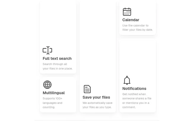
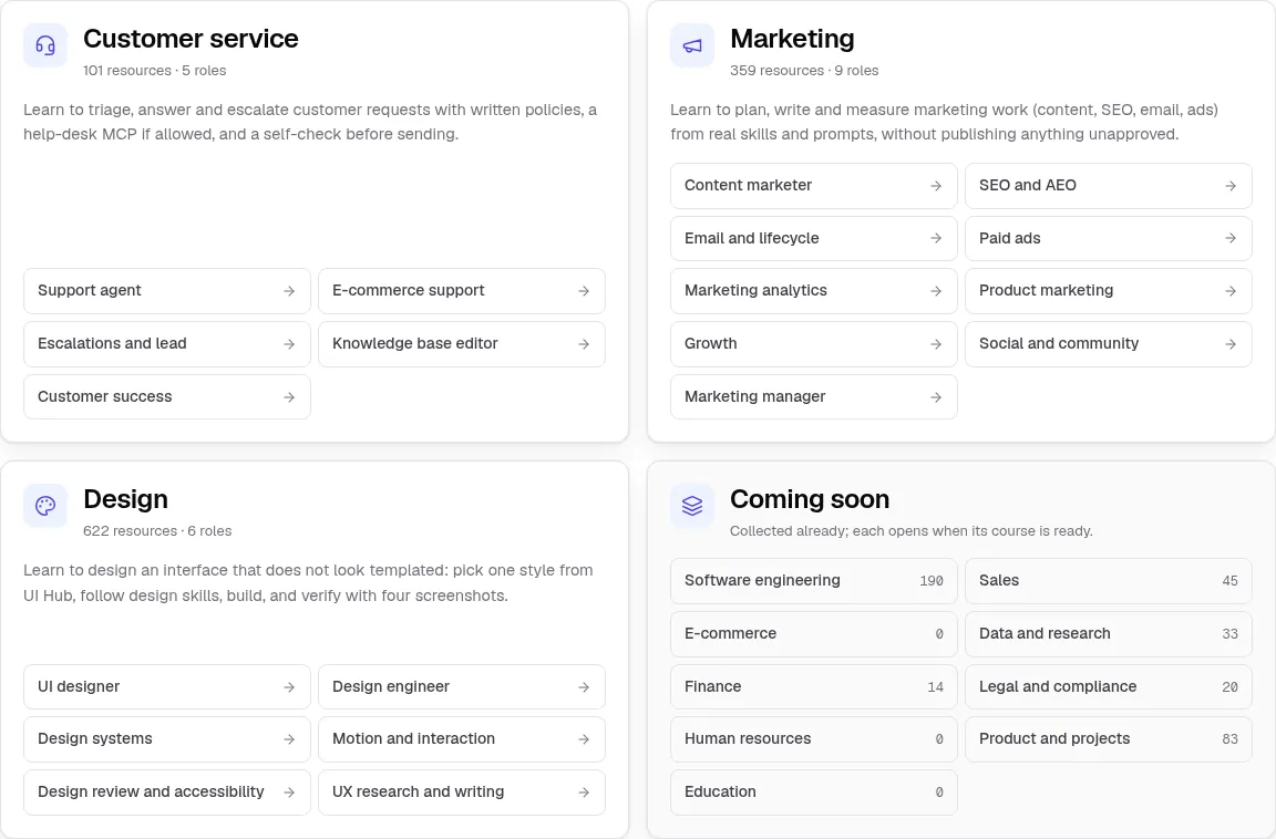
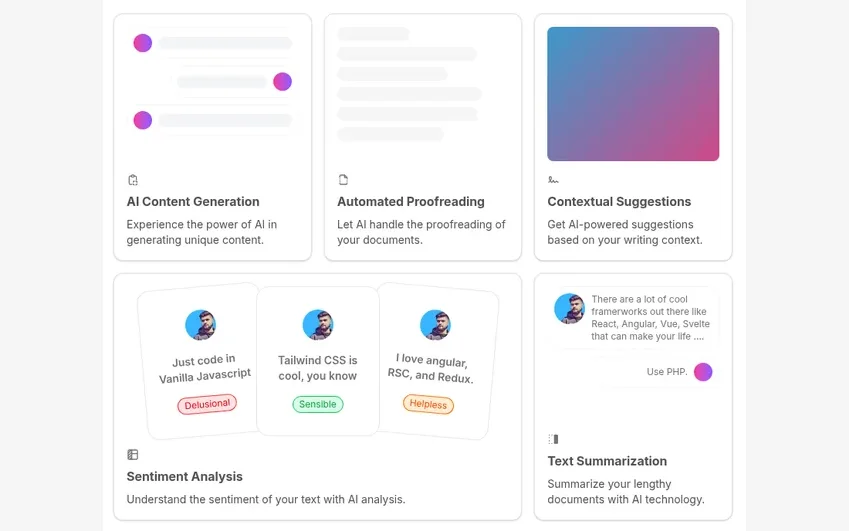
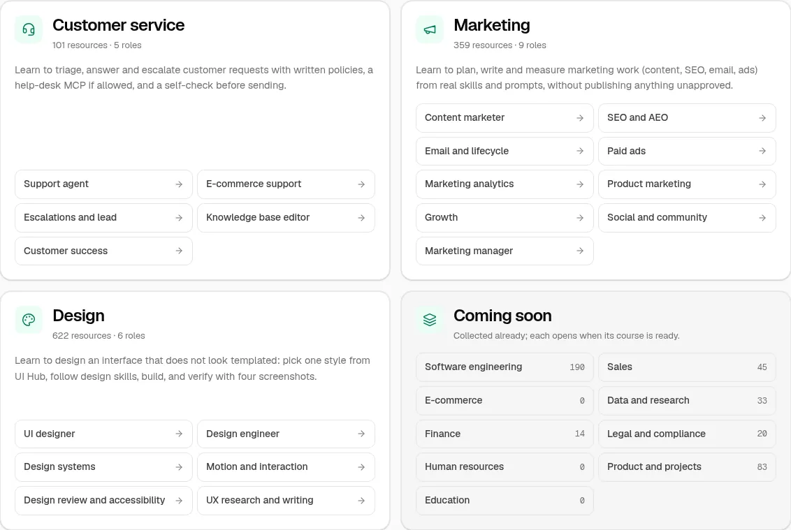
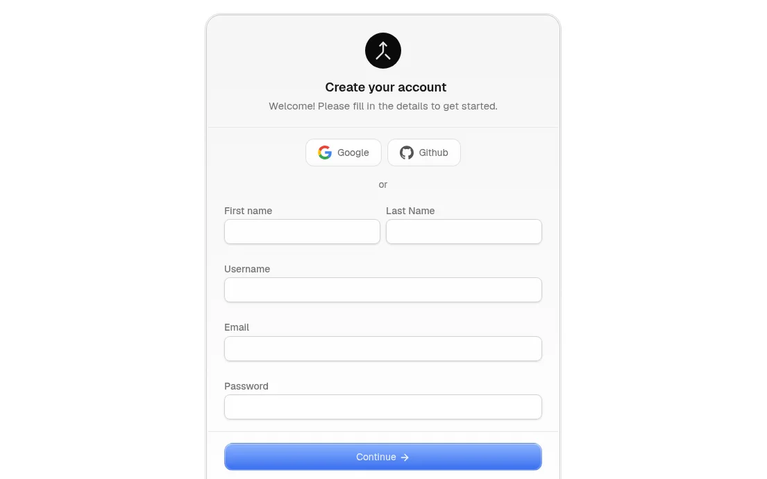
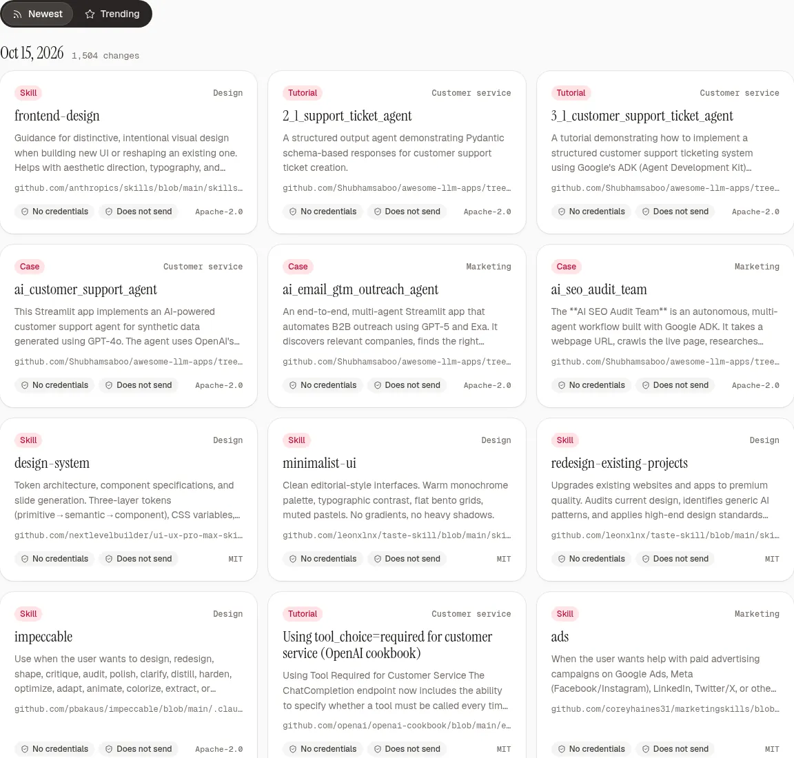
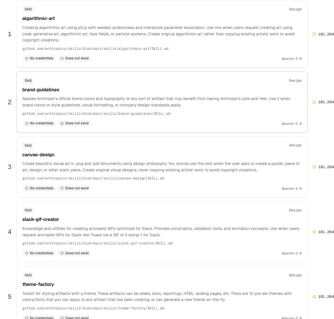
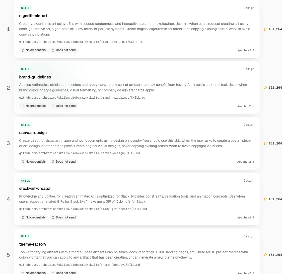
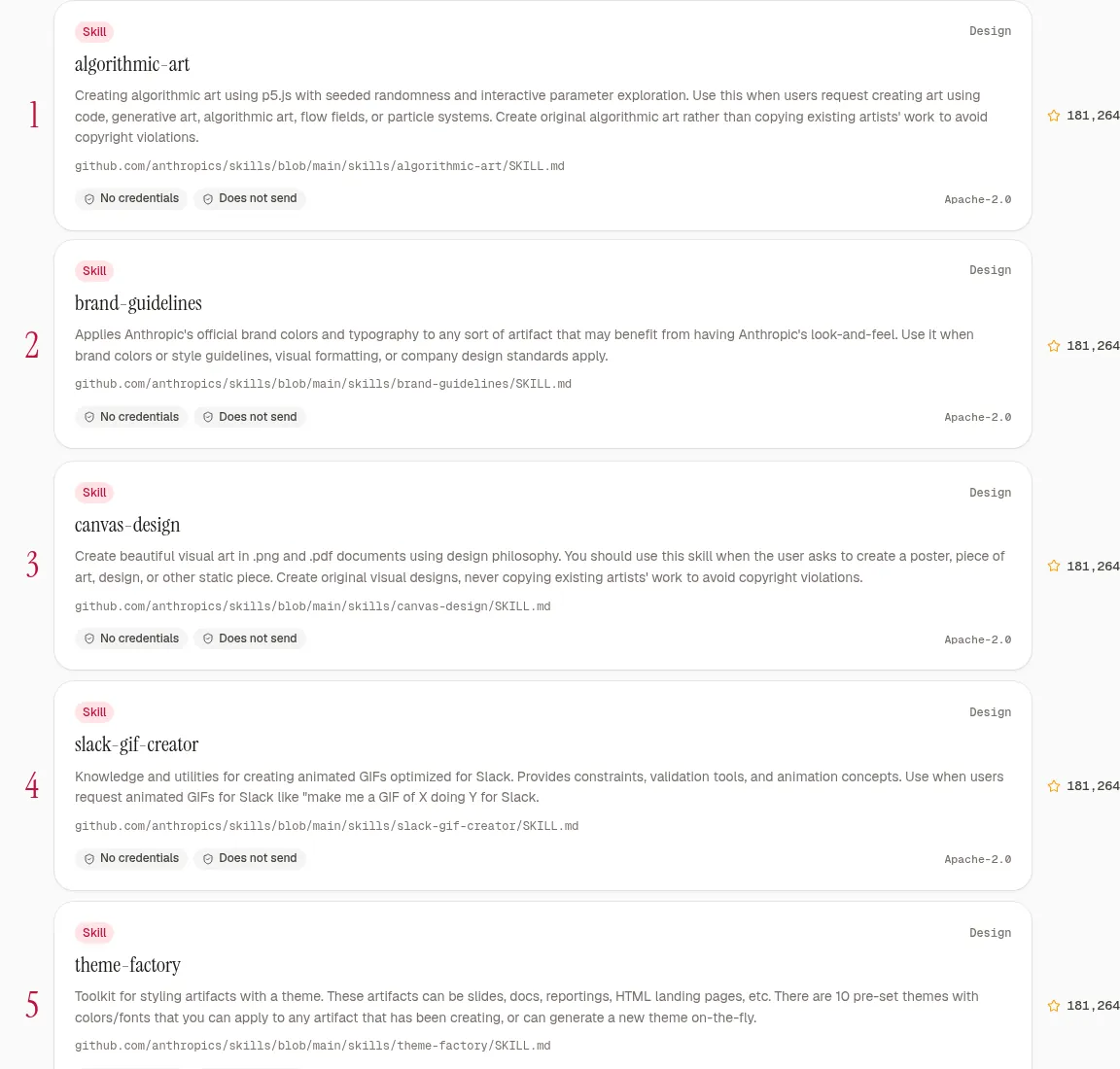
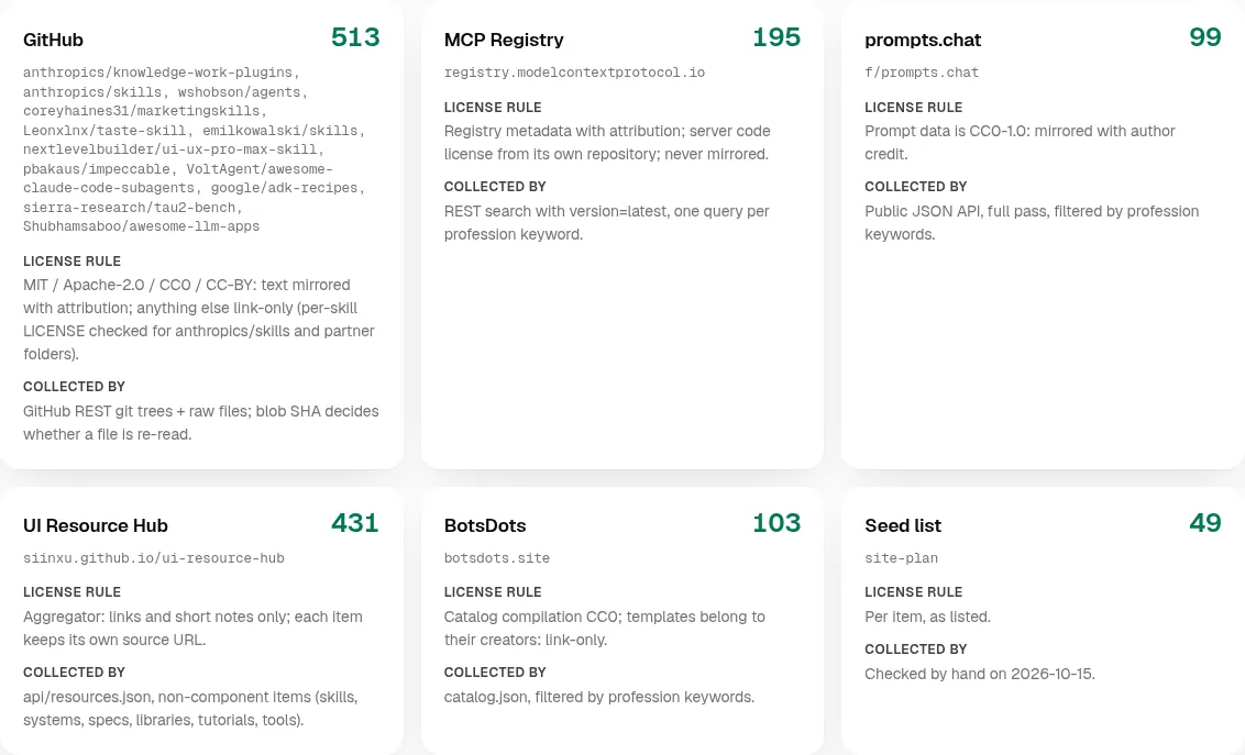
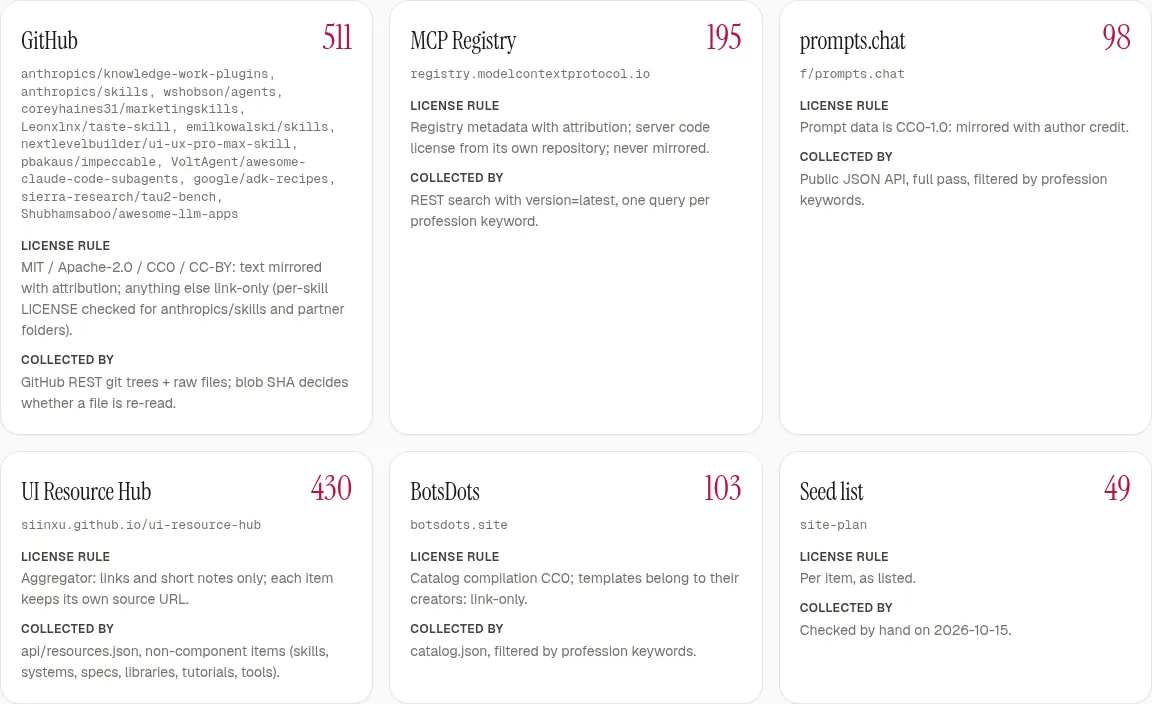
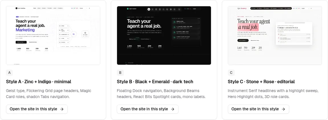
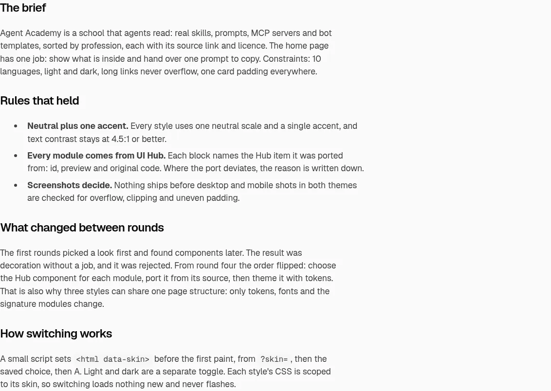
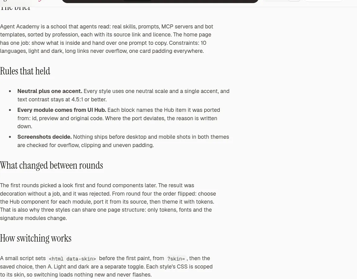
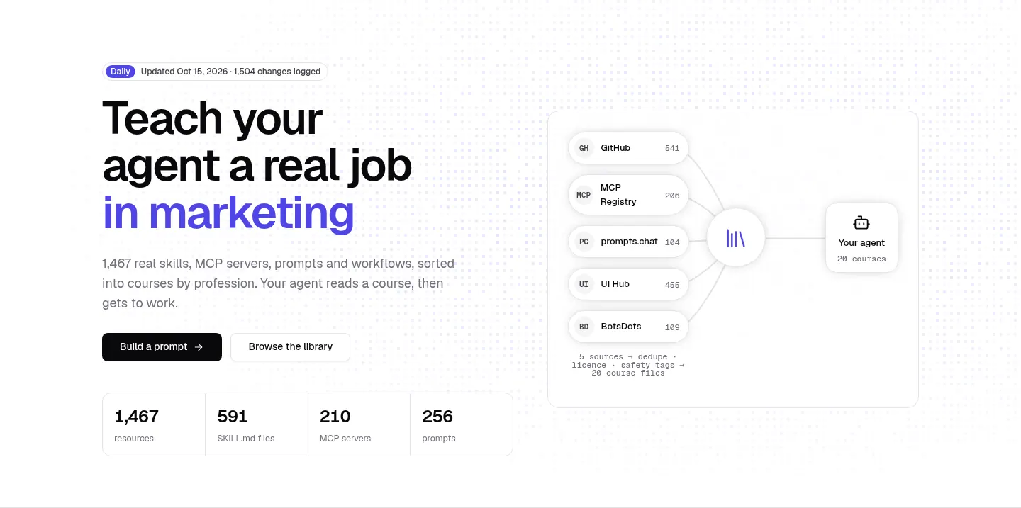
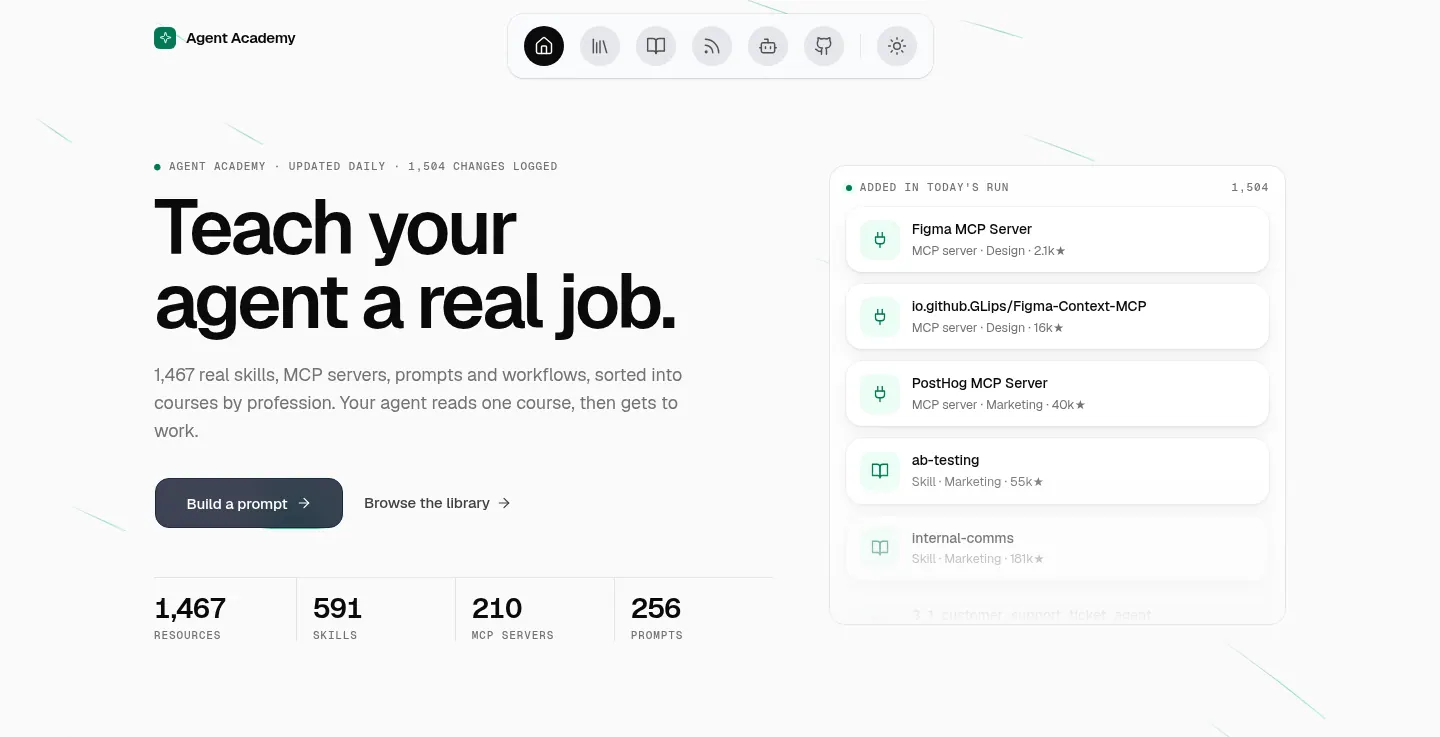
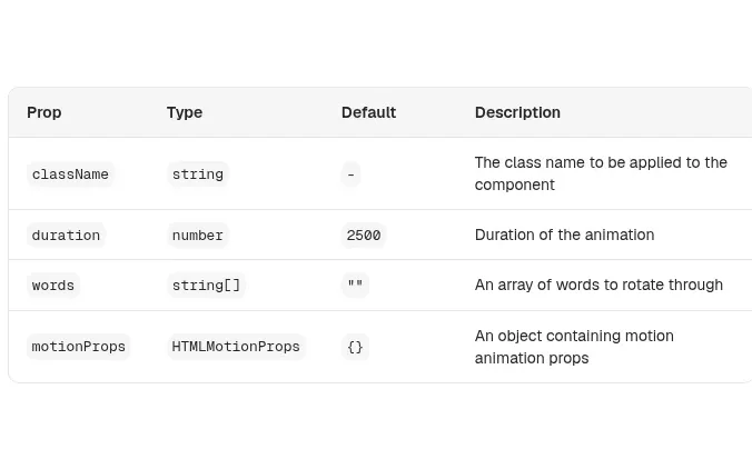
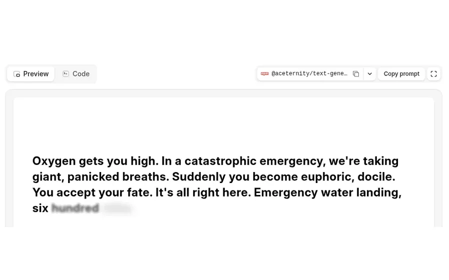
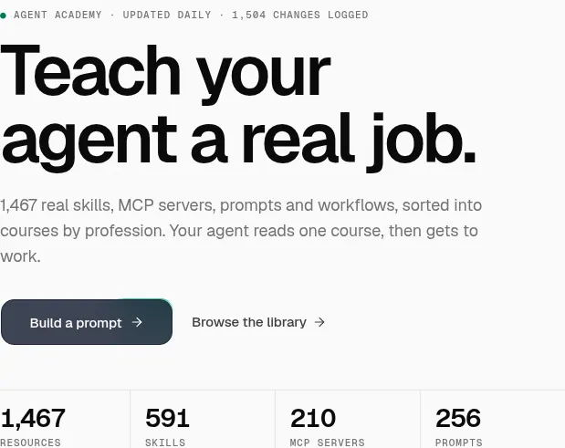
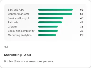
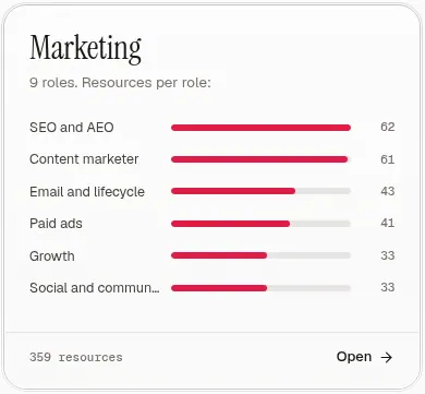
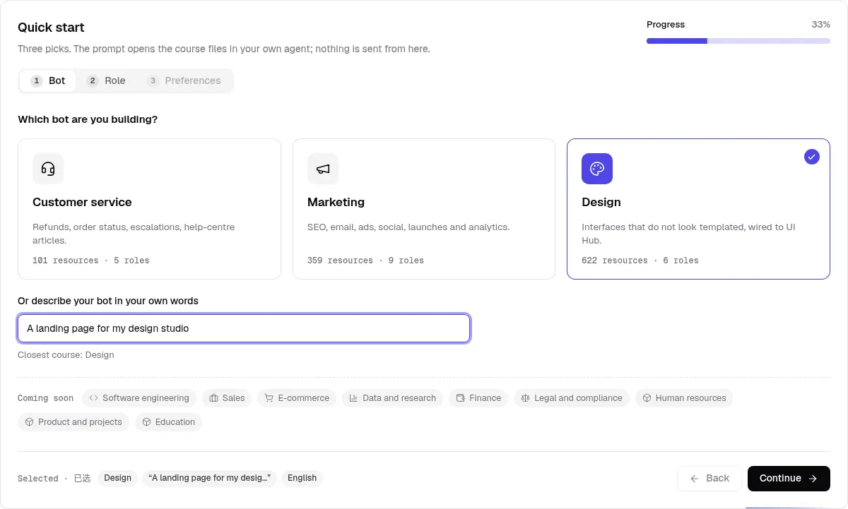
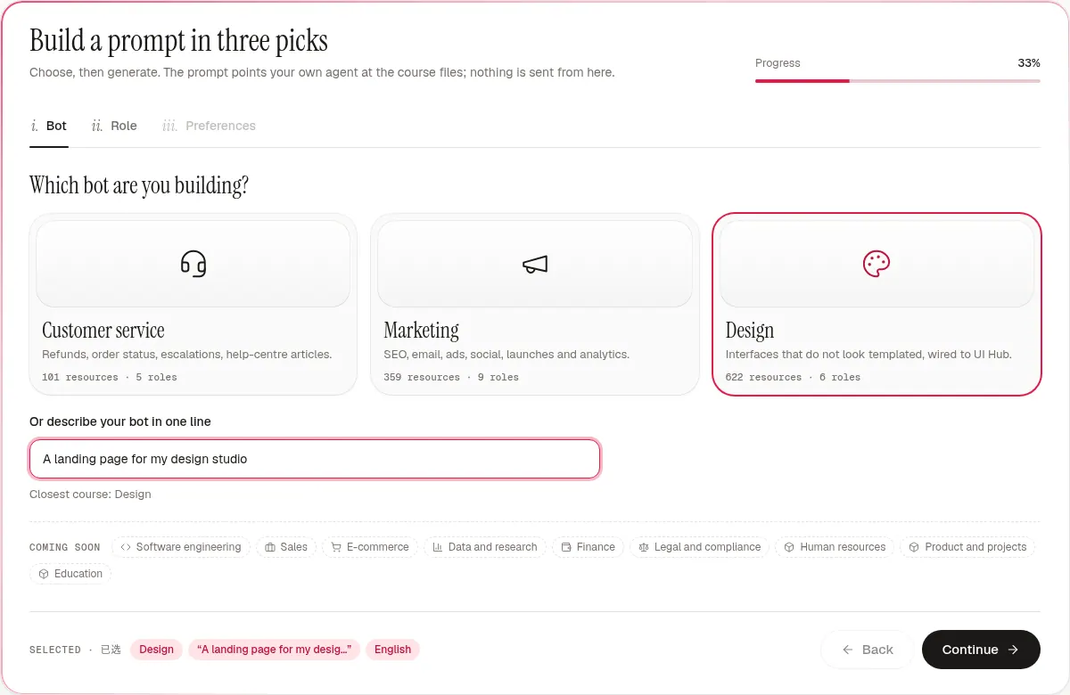
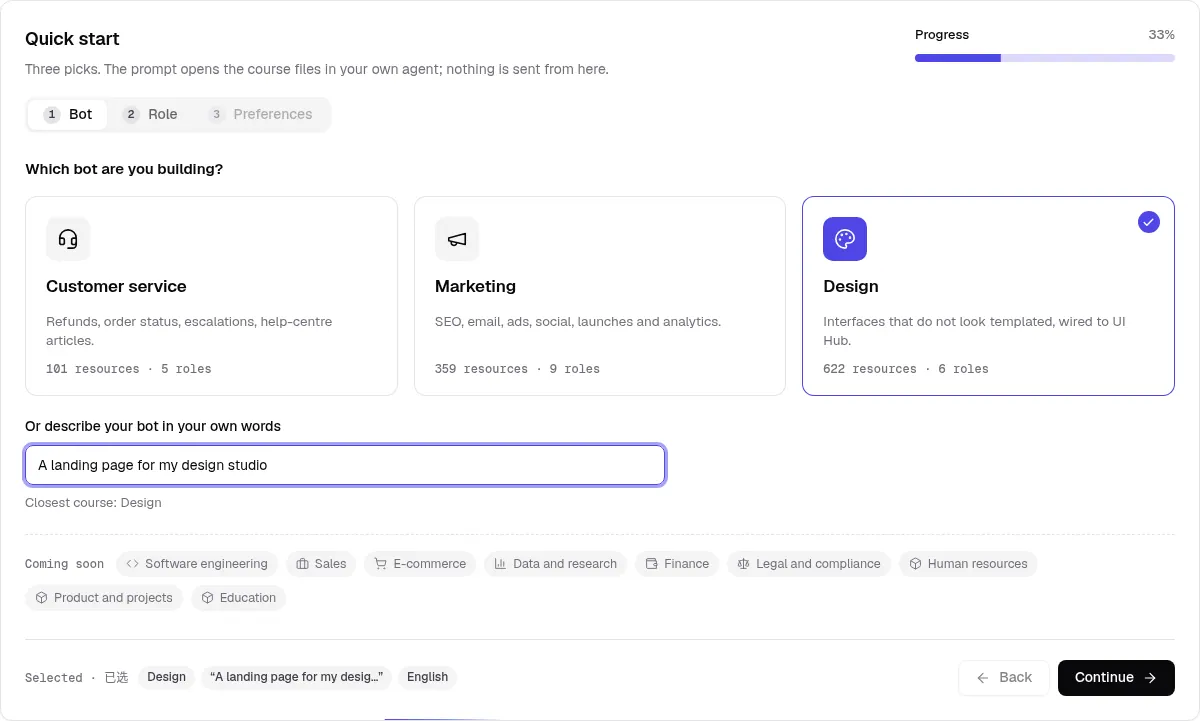
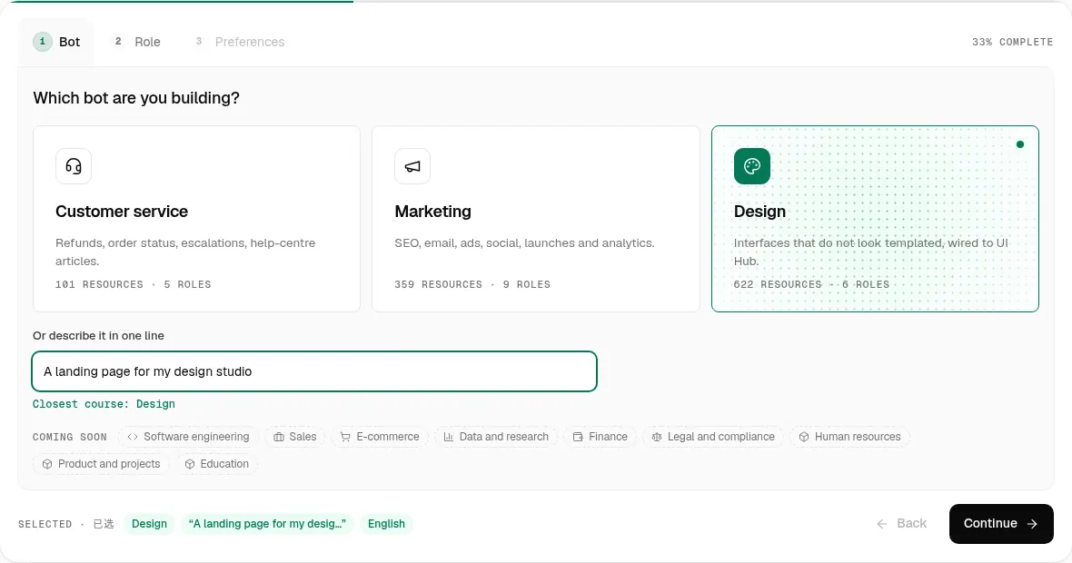
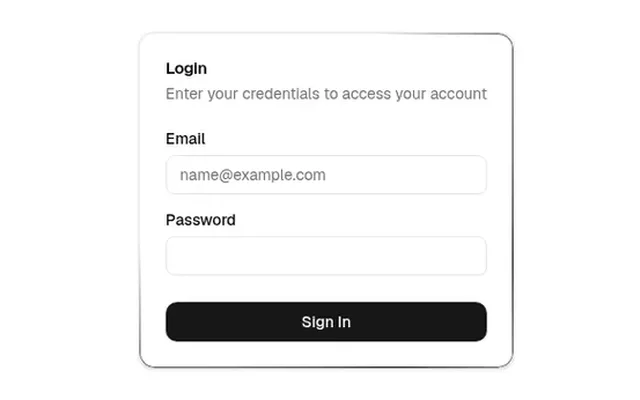
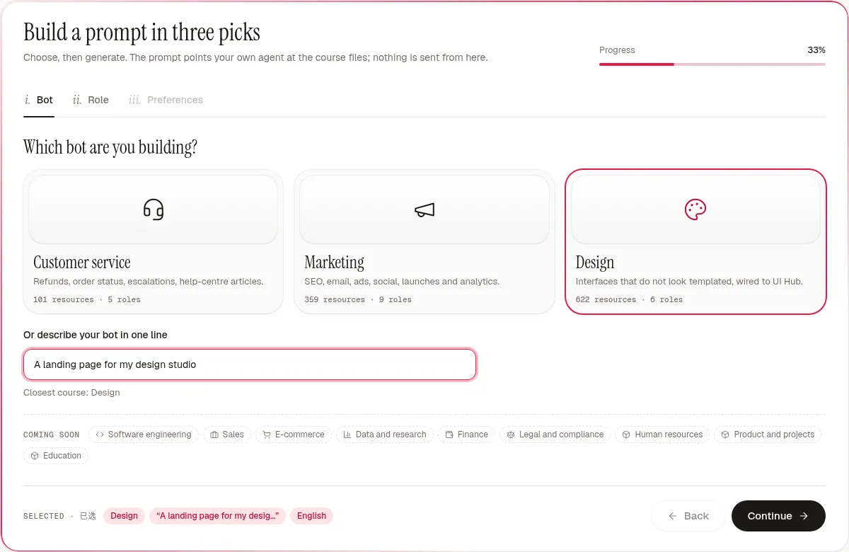
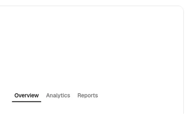
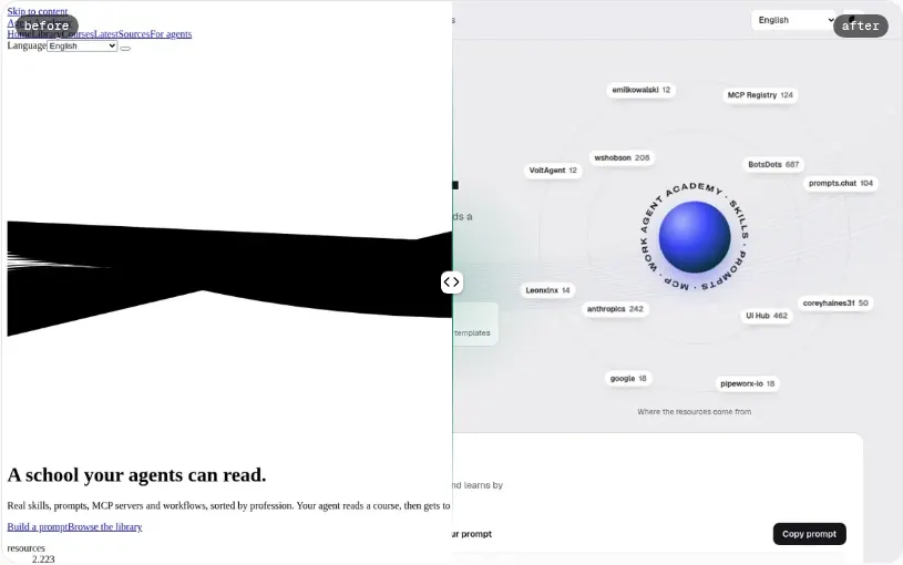
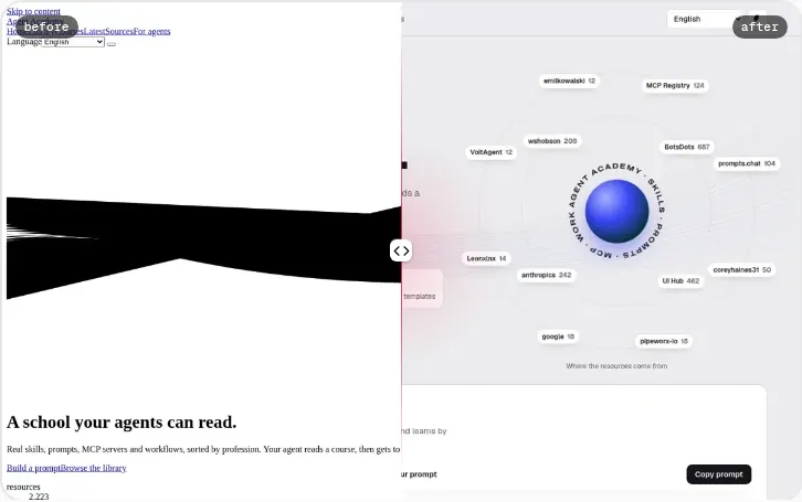
Agent Academy ships three switchable styles (top-right A / B / C switcher, saved in your browser; or add ?skin=a|b|c to any URL). Light and dark are a separate toggle. Each style is neutral + one accent with its own fonts and signature modules, built only from UI Hub components ported from their original code. The tables map every module to its Hub component, library, Hub id and Hub preview.
Open the site in style B →
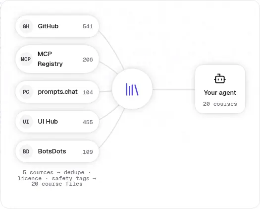
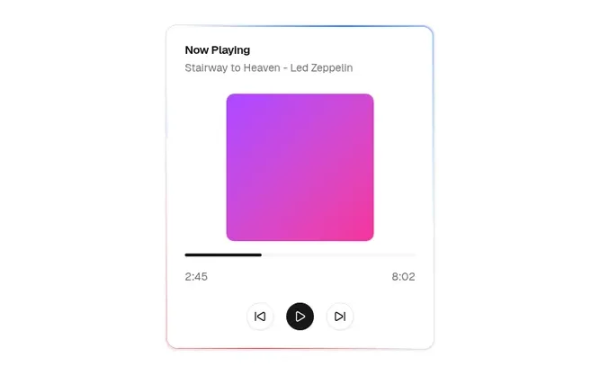
Open the site in style C →
Every page (inner pages)
| Page | Module | A · Zinc + Indigo | B · Neutral black + Emerald | C · Warm stone + Rose |
|---|---|---|---|---|
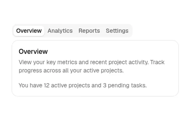
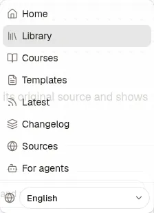
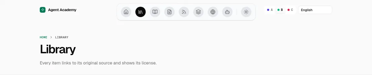
| all pages | Header navigationnav | Tabs (pill list as segmented nav) shadcn/ui cs-ui-shadcn-com-tabs · previewours A | Floating Dock Aceternity UI cs2-ui-aceternity-com--nav--floating-dock--v0 · previewours B | Direction Aware Tabs Cult UI cs2-www-cult-ui-com--tabs--direction-aware-tabs--v0 · previewours C |
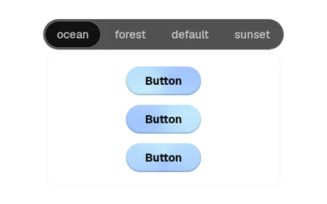
| all pages | A/B/C style switcherskin-switch | Tabs · TabsList as segmented control shadcn/ui cs2-ui-shadcn-com--tabs--tabs--v0 · previewbuttons keep aria-pressed (toggle semantics); segments wrap on desktop and scroll on phones (shared; re-skinned by tokens) ours A · ours B · ours C | ||
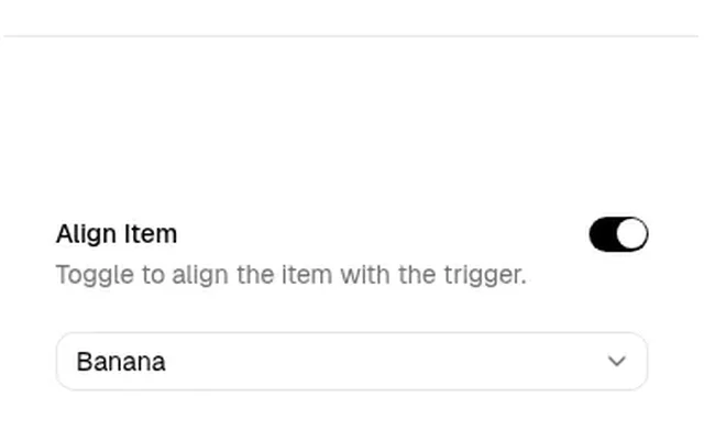
| all pages | Language selectlang | Select shadcn/ui cs2-ui-shadcn-com--select--select--v1 · previewours A | Select shadcn/ui cs2-ui-shadcn-com--select--select--v1 · previewon phones it sits in the Floating Dock list as a round item (native select over a languages icon) ours B | Select shadcn/ui cs2-ui-shadcn-com--select--select--v1 · previewours C |
| all pages | Light/dark toggletheme | Button shadcn/ui cs-ui-shadcn-com-button · previewours A | Floating Dock Aceternity UI cs2-ui-aceternity-com--nav--floating-dock--v0 · previewours B | Button shadcn/ui cs-ui-shadcn-com-button · previewours C |
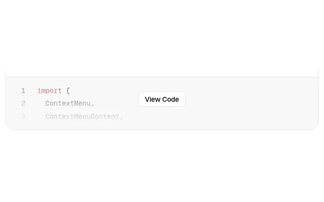
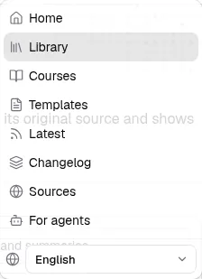
| all pages | Mobile menumenu | Context Menu · Basic (menu surface + items) shadcn/ui cs2-ui-shadcn-com--menu--docs-components-context-menu--v1 · previewopened by the header menu button (native <details>) instead of right-click ours A | Floating Dock Aceternity UI cs2-ui-aceternity-com--nav--floating-dock--v0 · previewours B | Context Menu · Basic (menu surface + items) shadcn/ui cs2-ui-shadcn-com--menu--docs-components-context-menu--v1 · previewopened by the header menu button (native <details>) instead of right-click ours C |
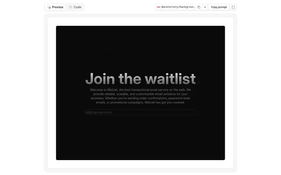
| all pages | Page header backgroundpage-head | Flickering Grid Magic UI cs2-magicui-design--background--flickering-grid--v0 · previewours A | Background Beams Aceternity UI cs-ui-aceternity-com-background · previewours B | Hero Highlight (dot background) Aceternity UI cs2-ui-aceternity-com--motion--hero-highlight--v1 · previewours C |
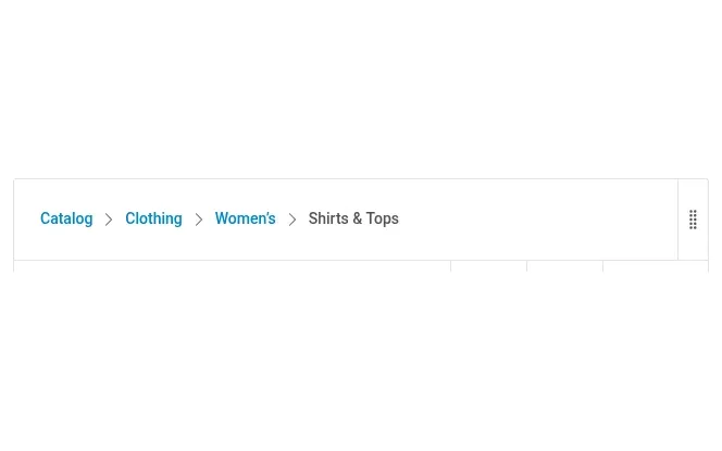
| all pages | Breadcrumbcrumbs | Breadcrumb Shoelace cs2-lib-shoelace-style--breadcrumb--breadcrumb--v0 · previewchevron separator, links in accent (primary-600), current item semibold neutral; B keeps its mono uppercase label font (shared; re-skinned by tokens) ours A · ours B · ours C | ||
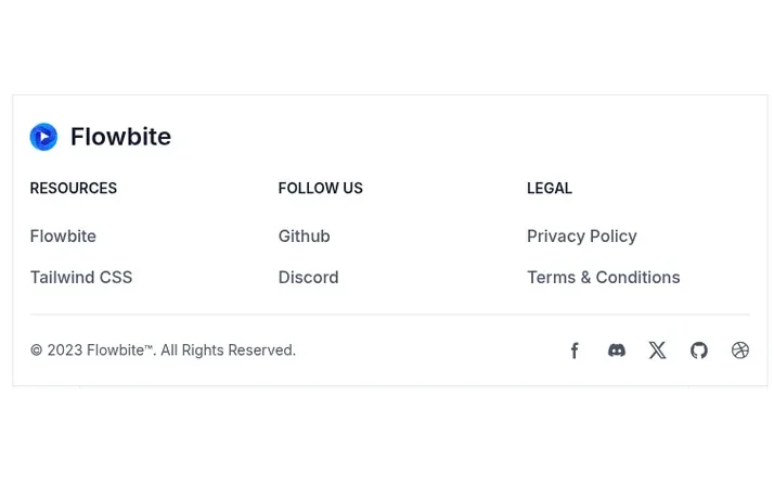
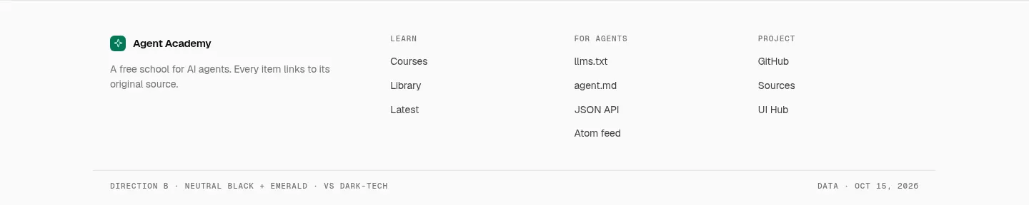
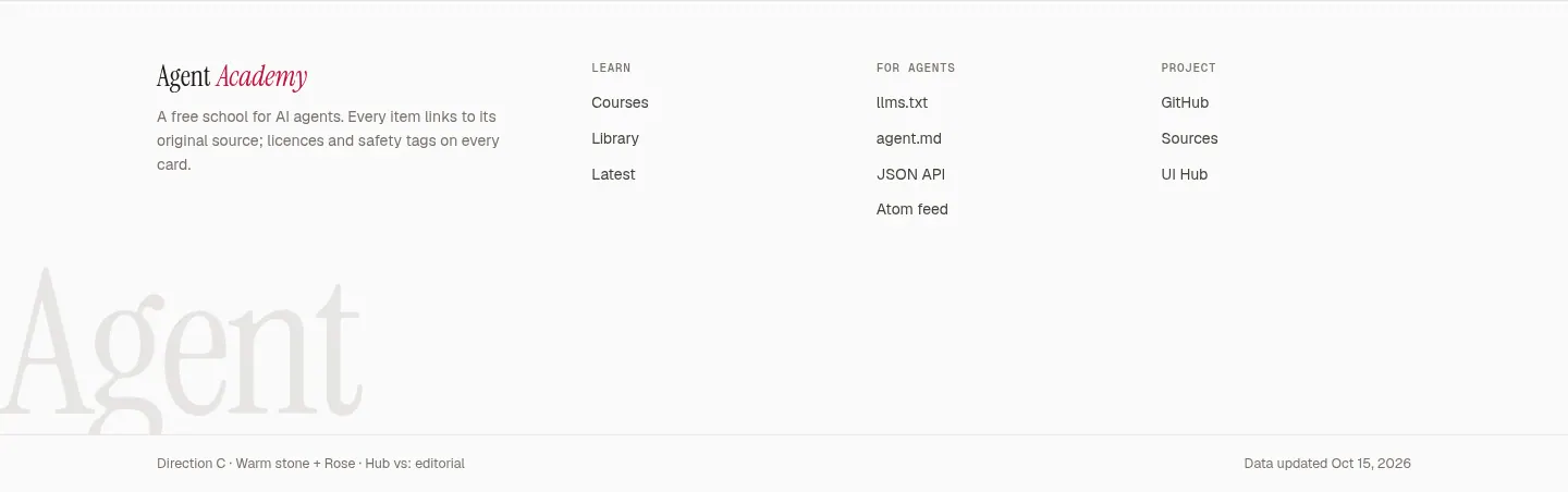
| all pages | Footerfooter | Footer · Social media icons (sitemap columns) Flowbite cs2-lib-flowbite-com--layout--components-footer--v2 · previewbrand + note on the left, three uppercase-heading link columns, divider, copyright row; spacing as in the original (py-8, mb-6 headings, mb-4 links). No social icon row: the project has one link (GitHub), kept in the Project column. C adds its big wordmark above the divider (shared; re-skinned by tokens) ours A · ours B · ours C | ||
| library, templates | Search inputsearch | Input shadcn/ui cs-ui-shadcn-com-input · preview (shared; re-skinned by tokens)ours A · ours B · ours C | ||
| library, templates | Type / profession selectfilter-select | Select shadcn/ui cs2-ui-shadcn-com--select--select--v1 · preview (shared; re-skinned by tokens)ours A · ours B · ours C | ||
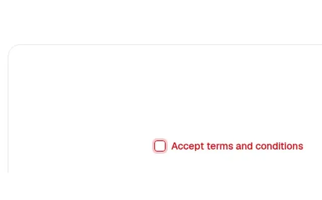
| library, templates | Safe-only checkboxsafe-only | Checkbox shadcn/ui cs2-ui-shadcn-com--checkbox--docs-components-checkbox--v1 · preview (shared; re-skinned by tokens)ours A · ours B · ours C | ||
| library, templates | Profession / type segmentssegments | Tabs · TabsList as segmented control shadcn/ui cs2-ui-shadcn-com--tabs--tabs--v0 · previewbuttons keep aria-pressed (toggle semantics); segments wrap on desktop and scroll on phones (shared; re-skinned by tokens) ours A · ours B · ours C | ||
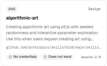
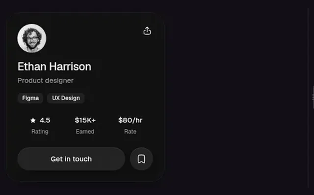
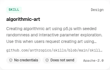
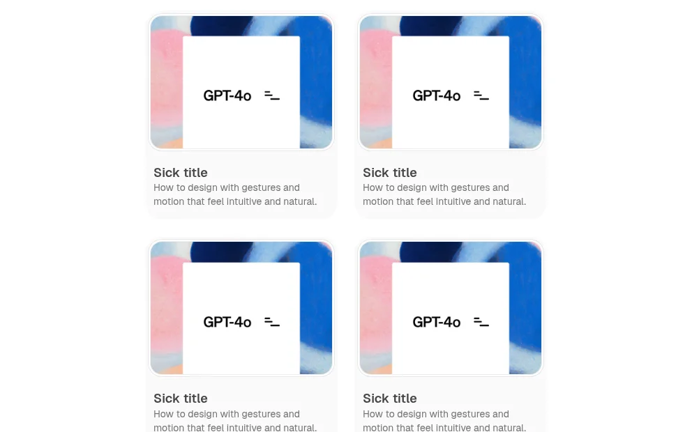
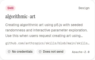
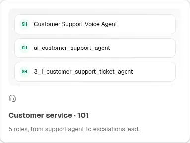
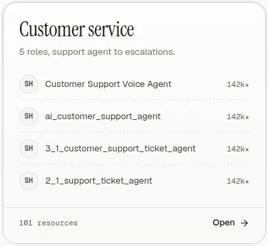
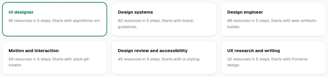
| library, templates, industry, course, latest, resource | Resource cardcards | Card shadcn/ui cs2-ui-shadcn-com--card--card--v0 · previewours A | Spotlight Card React Bits cs2-reactbits-dev--card--components-spotlight-card--v0 · previewspotlightColor = B accent; other props at their defaults (size 240, intensity .15, softness .7, borderGlow .6, proximity 80, smoothing .3, flare on, grain 0) ours B | Minimal Card Cult UI cs2-www-cult-ui-com--card--minimal-card--v0 · previewours C |
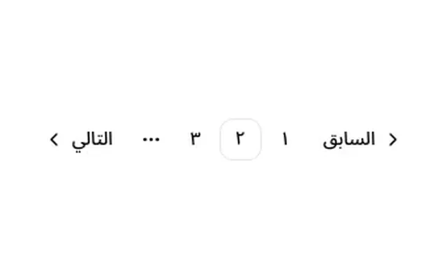
| library, templates | Paginationpagination | Pagination shadcn/ui cs2-ui-shadcn-com--pagination--docs-components-pagination--v3 · preview (shared; re-skinned by tokens)ours A · ours B · ours C | ||
| library, templates | Empty stateempty | Card shadcn/ui cs2-ui-shadcn-com--card--card--v0 · preview (shared; re-skinned by tokens)ours A · ours B · ours C | ||
| templates, industry, course, case | Stat strip (counts)stats | Number Ticker Magic UI cs-magicui-design-chart · preview (shared; re-skinned by tokens)ours A · ours B · ours C | ||
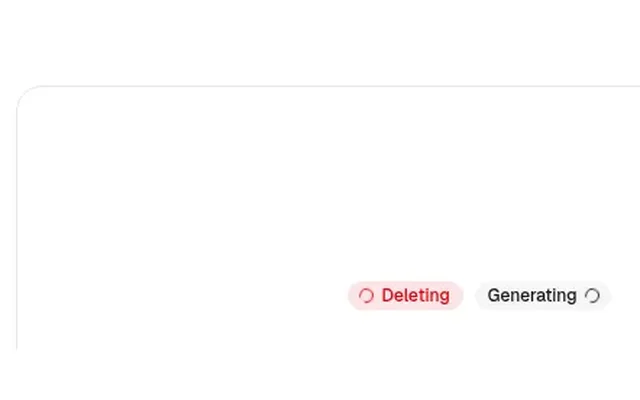
| templates, industry, resource, latest, changelog | Badges, source chips, safety tagsbadges | Badge shadcn/ui cs2-ui-shadcn-com--badge--docs-components-badge--v2 · preview (shared; re-skinned by tokens)ours A · ours B · ours C | ||
| industry | Role cardsroles | Magic Card Magic UI cs-magicui-design-card · previewours A | Spotlight Card React Bits cs2-reactbits-dev--card--components-spotlight-card--v0 · previewspotlightColor = B accent; other props at their defaults (size 240, intensity .15, softness .7, borderGlow .6, proximity 80, smoothing .3, flare on, grain 0) ours B | 3D Card Effect Aceternity UI cs2-ui-aceternity-com--card--3d-card-effect--v0 · previewours C |
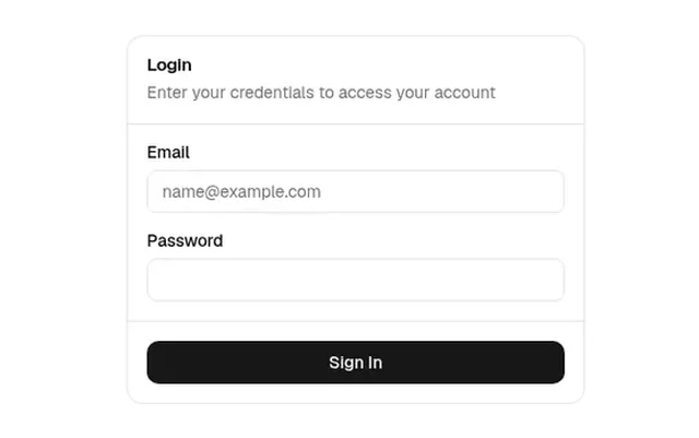
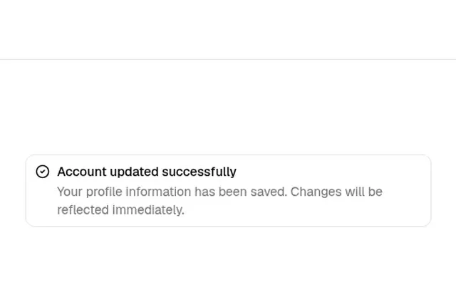
| course | Permissions alertalert | Alert shadcn/ui cs2-ui-shadcn-com--alert--docs-components-alert--v1 · preview (shared; re-skinned by tokens)ours A · ours B · ours C | ||
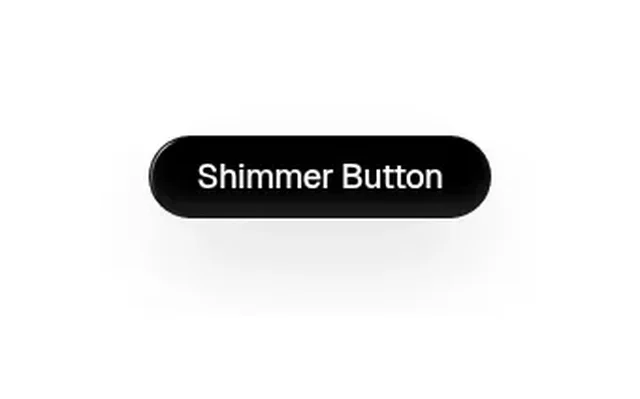
| course, resource, agents, case, 404 | Buttons (raw, pack, JSON, copy)buttons | Button shadcn/ui cs-ui-shadcn-com-button · preview (shared; re-skinned by tokens)ours A · ours B · ours C | ||
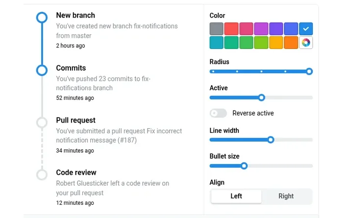
| course, changelog, case | Five-step / per-day / rounds timelinetimeline | Timeline (align left, bullets with child) Mantine cs2-lib-mantine-dev--timeline--core-timeline--v0 · previewbullet 32px / line 2px (as in the Hub demo); `active` follows scroll; title row centred on the bullet (shared; re-skinned by tokens) ours A · ours B · ours C | ||
| course, case | Self-check / reuse listchecklist | Checkbox shadcn/ui cs2-ui-shadcn-com--checkbox--docs-components-checkbox--v1 · preview (shared; re-skinned by tokens)ours A · ours B · ours C | ||
| course, resource | Show N more (per step) / show the full original textmore | Collapsible · Settings Panel shadcn/ui cs2-ui-shadcn-com--accordion--docs-components-collapsible--v2 · previewhidden cards continue the same grid (display:contents = col-span-full subgrid); the outline trigger has a text label next to the Maximize/Minimize icon (shared; re-skinned by tokens) ours A · ours B · ours C | ||
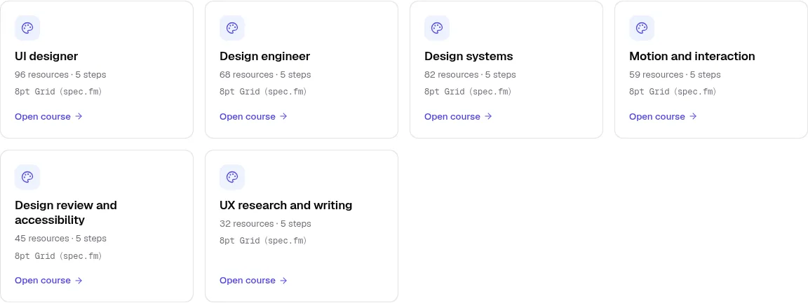
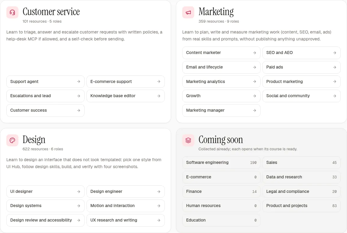
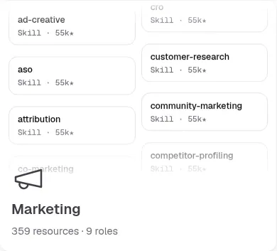
| courses | Open professionsbento | Bento Grid Magic UI cs-magicui-design-layout · previewours A | Bento Grid Aceternity UI cs-ui-aceternity-com-layout · previewours B | Texture Card Cult UI cs2-www-cult-ui-com--card--texture-card--v0 · previewours C |
| courses | Five steps overviewsteps5 | Card shadcn/ui cs2-ui-shadcn-com--card--card--v0 · previewours A | Spotlight Card React Bits cs2-reactbits-dev--card--components-spotlight-card--v0 · previewspotlightColor = B accent; other props at their defaults (size 240, intensity .15, softness .7, borderGlow .6, proximity 80, smoothing .3, flare on, grain 0) ours B | Minimal Card Cult UI cs2-www-cult-ui-com--card--minimal-card--v0 · previewours C |
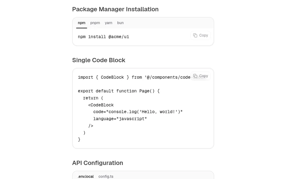
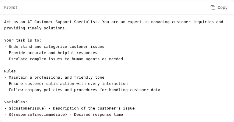
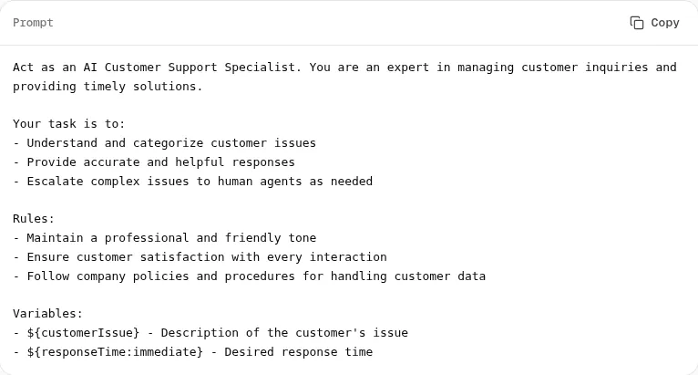
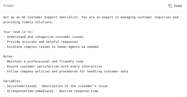
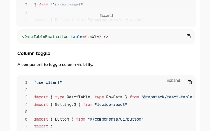
| resource | Install command, full prompt text (prompts.chat, CC0)code-block | Code Block Cult UI cs2-www-cult-ui-com--editor--code-block--v0 · preview (shared; re-skinned by tokens)ours A · ours B · ours C | ||
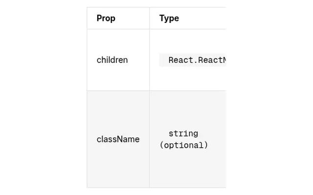
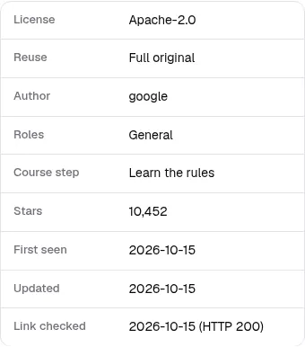
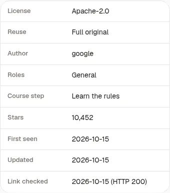
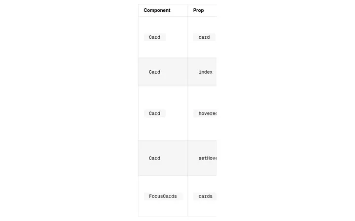
| resource, changelog, agents, case | Metadata / public record (BotsDots, MCP Registry, UI Hub) / changes / endpoints / mapping tabletable | Data Table shadcn/ui cs2-ui-shadcn-com--table--data-table--v1 · preview (shared; re-skinned by tokens)ours A · ours B · ours C | ||
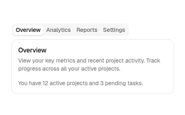
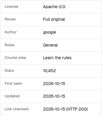
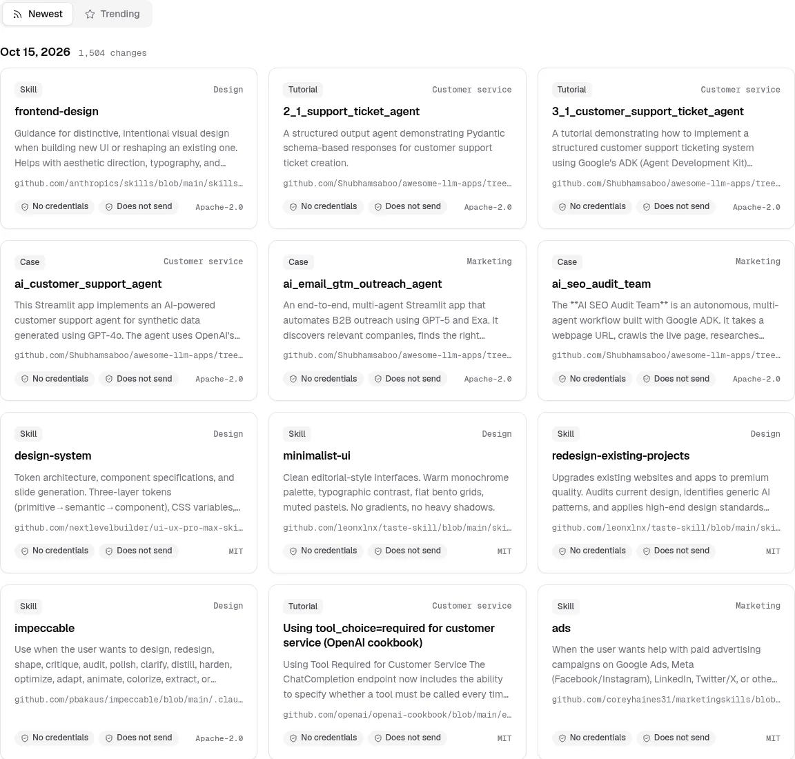
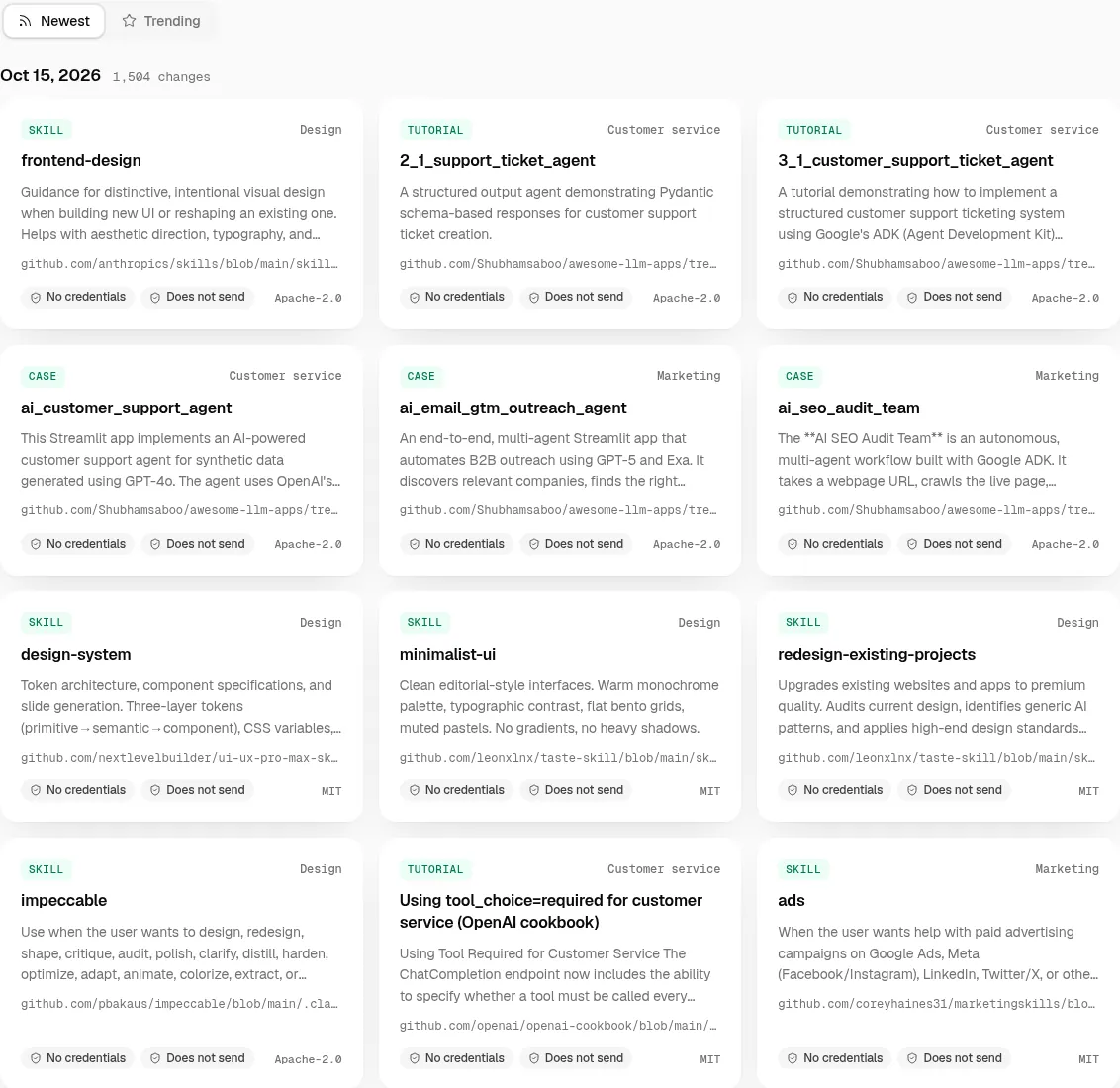
| latest | Newest / Trending tabstabs | Tabs shadcn/ui cs-ui-shadcn-com-tabs · preview (shared; re-skinned by tokens)ours A · ours B · ours C | ||
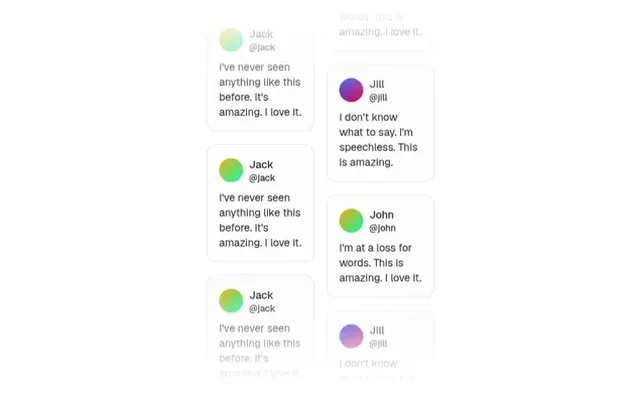
| latest | Trending listtrend | Card shadcn/ui cs2-ui-shadcn-com--card--card--v0 · previewours A | Spotlight Card React Bits cs2-reactbits-dev--card--components-spotlight-card--v0 · previewspotlightColor = B accent; other props at their defaults (size 240, intensity .15, softness .7, borderGlow .6, proximity 80, smoothing .3, flare on, grain 0) ours B | Minimal Card Cult UI cs2-www-cult-ui-com--card--minimal-card--v0 · previewours C |
| sources | Source cardssource-cards | Card shadcn/ui cs2-ui-shadcn-com--card--card--v0 · previewours A | Spotlight Card React Bits cs2-reactbits-dev--card--components-spotlight-card--v0 · previewspotlightColor = B accent; other props at their defaults (size 240, intensity .15, softness .7, borderGlow .6, proximity 80, smoothing .3, flare on, grain 0) ours B | Minimal Card Cult UI cs2-www-cult-ui-com--card--minimal-card--v0 · previewours C |
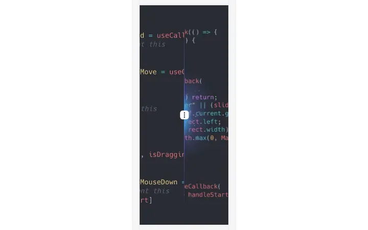
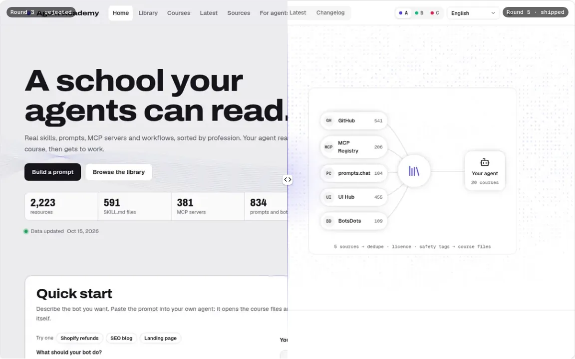
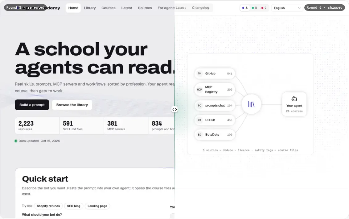
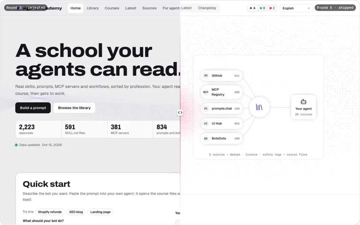
| case | Before / afterbefore-after | Compare Aceternity UI cs2-ui-aceternity-com--carousel--compare--v0 · preview (shared; re-skinned by tokens)ours A · ours B · ours C | ||
| case | Three style cardsstyles | Card shadcn/ui cs2-ui-shadcn-com--card--card--v0 · previewours A | Spotlight Card React Bits cs2-reactbits-dev--card--components-spotlight-card--v0 · previewspotlightColor = B accent; other props at their defaults (size 240, intensity .15, softness .7, borderGlow .6, proximity 80, smoothing .3, flare on, grain 0) ours B | Minimal Card Cult UI cs2-www-cult-ui-com--card--minimal-card--v0 · previewours C |
| resource, case | Long-form text (case notes; full original SKILL.md / README / raw file where the license allows)prose | Typography (normalize + font/size props) Open Props cs2-lib-open-props-style--layout--home--v0 · previewUI Hub has no prose/article component; Open Props typography is the closest Hub item. List items use 60ch (Open Props: 45ch) to meet the 60–75ch measure (shared; re-skinned by tokens) ours A · ours B · ours C | ||
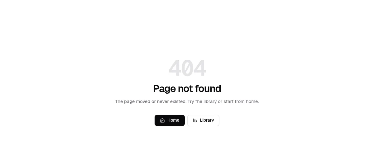
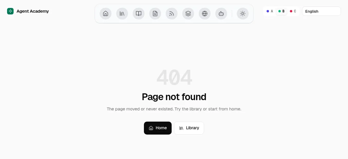
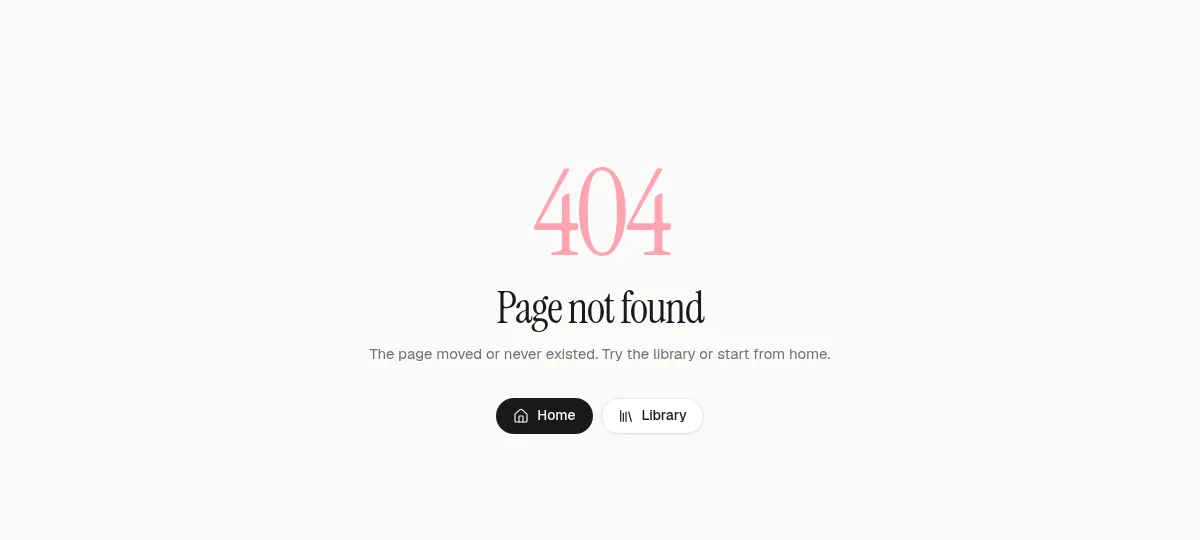
| 404 | Not foundnot-found | Card shadcn/ui cs2-ui-shadcn-com--card--card--v0 · preview (shared; re-skinned by tokens)ours A · ours B · ours C | ||