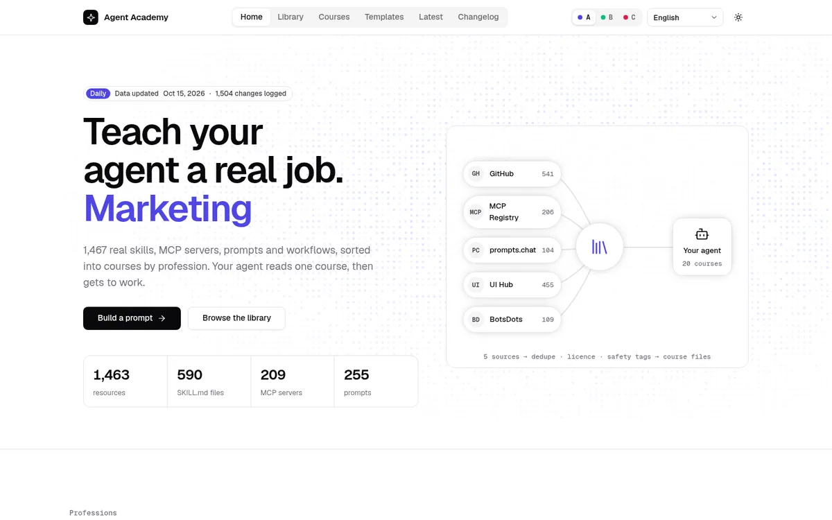
A
Style A · Zinc + Indigo · minimal
Geist type, Flickering Grid page headers, Magic Card roles, shadcn Tabs navigation.
Agent Academy is a free, source-linked library of skills, prompts, MCP servers and bot templates, organised into courses by profession, for people who hand real work to AI agents: 1,467 live resources, each with its original link, license and safety tags.
Design course, first case
From a rejected first look to one site in three switchable styles: the rounds, the rules, and the UI Hub component behind every module.
Drag the handle. Left: the round-3 home page that was rejected. Right: the shipped home page in style A.
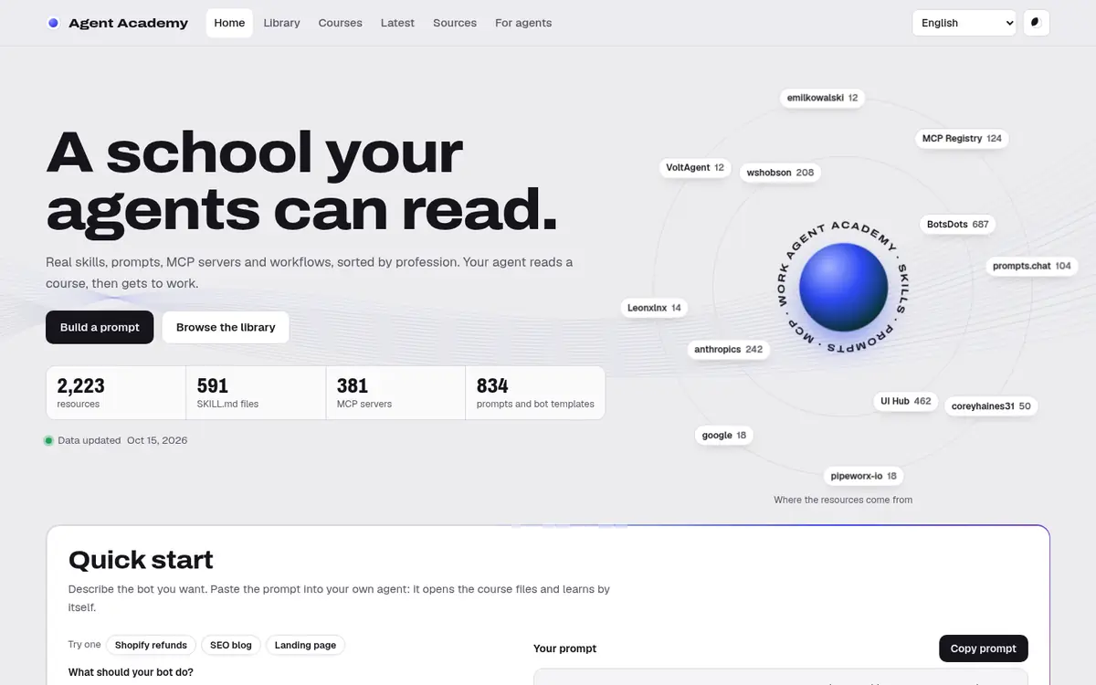 Round 3 · rejectedRound 5 · shipped
All three directions were kept: A is the default, B and C are switchable themes. Each keeps its own fonts and signature modules, not just its colours.
Geist type, Flickering Grid page headers, Magic Card roles, shadcn Tabs navigation.
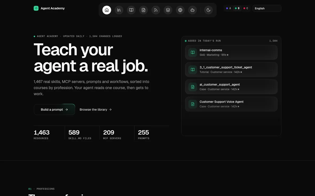
Floating Dock navigation, Background Beams headers, React Bits Spotlight cards, mono labels.
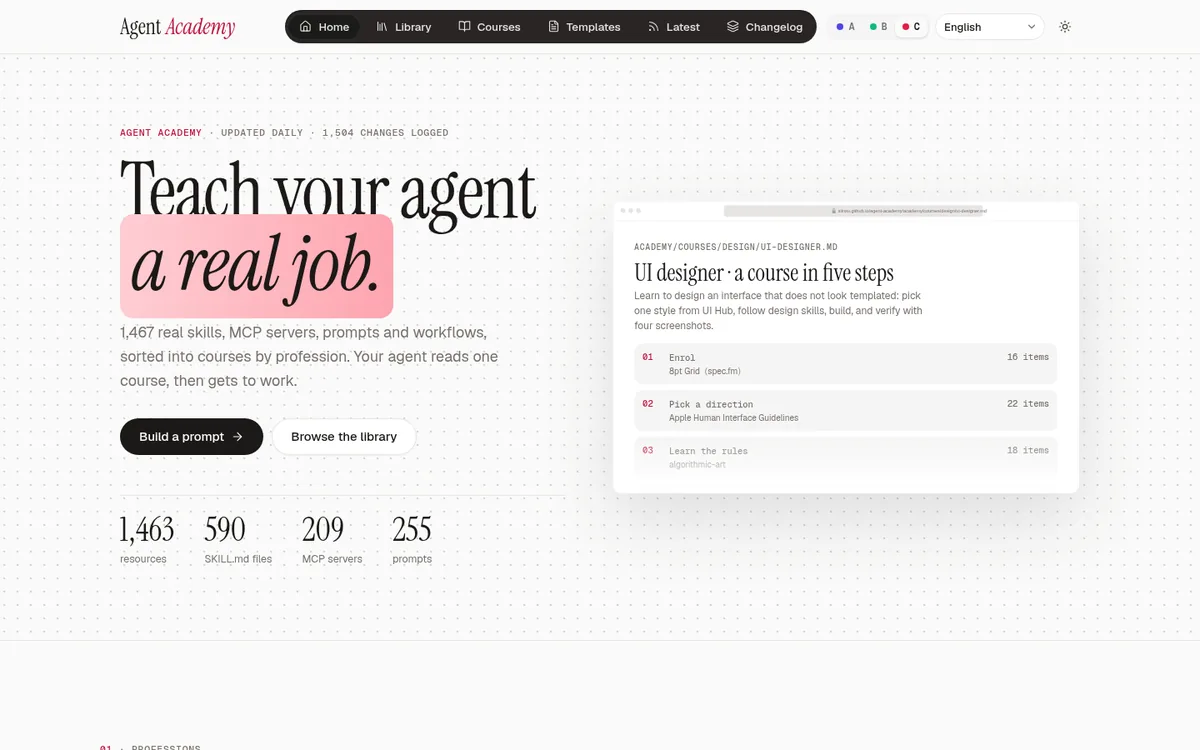
Instrument Serif headlines with a highlight sweep, Hero Highlight dots, 3D role cards.
What changed each time, and why.
UI Hub styles were clustered and editorial × motion was picked. It shipped, but the look came first and the components second.
More effects were added to make it feel richer. The user called it ugly: too many accents, decoration without a job.
New rules: neutral plus one accent, and every module ported from a UI Hub component’s source code. Three home pages were built side by side.
The user kept all three. A became the default; B and C became themes. Every page was rebuilt in 10 languages and the daily update kept running.
Each change is checked at 1440 and 390 px, light and dark, in every style; then Lighthouse runs on the home page and a detail page. Fix, repeat.
Agent Academy 是一所给 agent 读的学校:真实的 skill、prompt、MCP 服务器和机器人模板,按职业整理,每一条都附原始链接和许可证。首页只有一件事要做:展示里面有什么,并交出一段可复制的 prompt。约束:10 种语言、浅色和深色、长链接永不溢出、所有卡片内边距一致。
前几轮先定外观,再去找组件。结果是没有用途的装饰,被否定了。从第 4 轮起顺序反过来:先为每个模块选定 Hub 组件,从源码移植,再用 token 上主题。这也是三种风格能共用同一套页面结构的原因:变的只有 token、字体和标志性模块。
一段小脚本在首次绘制前设置 <html data-skin>,依次取 ?skin=、已保存的选择,否则用 A。浅色和深色是单独的开关。每种风格的 CSS 只作用于自己的皮肤,所以切换时不加载新文件,也不会闪烁。
Agent Academy 是一所給 agent 讀的學校:真實的 skill、prompt、MCP 伺服器和機器人範本,依職業整理,每一條都附原始連結和授權。首頁只有一件事要做:展示裡面有什麼,並交出一段可複製的 prompt。限制:10 種語言、淺色和深色、長連結永不溢出、所有卡片內距一致。
前幾輪先定外觀,再去找元件。結果是沒有用途的裝飾,被否決了。從第 4 輪起順序反過來:先為每個模組選定 Hub 元件,從原始碼移植,再用 token 套主題。這也是三種風格能共用同一套頁面結構的原因:變的只有 token、字型和招牌模組。
一段小腳本在首次繪製前設定 <html data-skin>,依序取 ?skin=、已儲存的選擇,否則用 A。淺色和深色是獨立的開關。每種風格的 CSS 只作用於自己的外觀,所以切換時不載入新檔案,也不會閃爍。
Agent Academy is a school that agents read: real skills, prompts, MCP servers and bot templates, sorted by profession, each with its source link and licence. The home page has one job: show what is inside and hand over one prompt to copy. Constraints: 10 languages, light and dark, long links never overflow, one card padding everywhere.
The first rounds picked a look first and found components later. The result was decoration without a job, and it was rejected. From round four the order flipped: choose the Hub component for each module, port it from its source, then theme it with tokens. That is also why three styles can share one page structure: only tokens, fonts and the signature modules change.
A small script sets <html data-skin> before the first paint, from ?skin=, then the saved choice, then A. Light and dark are a separate toggle. Each style's CSS is scoped to its skin, so switching loads nothing new and never flashes.
Agent Academy は、エージェントが読む学校です。実在のスキル、プロンプト、MCP サーバー、ボットテンプレートを職種別に整理し、すべてに出典リンクとライセンスを付けています。トップページの役割は 1 つ。中身を見せて、コピーできるプロンプトを 1 つ渡すこと。制約:10 言語、ライト/ダーク、長いリンクを絶対にはみ出させない、カードの余白はどこでも同じ。
最初のラウンドは見た目を先に決め、コンポーネントを後から探しました。結果は役割のない装飾で、却下されました。ラウンド 4 から順序を逆にしました。モジュールごとに Hub コンポーネントを選び、ソースから移植し、最後にトークンでテーマを付ける。だから 3 つのスタイルが同じページ構造を共有できます。変わるのはトークン、フォント、特徴的なモジュールだけです。
小さなスクリプトが最初の描画より前に <html data-skin> を設定します。優先順は ?skin=、保存された選択、そして A。ライト/ダークは別のトグルです。各スタイルの CSS はそのスキンにだけ効くので、切り替えても新しく読み込むものはなく、ちらつきもありません。
Agent Academy는 에이전트가 읽는 학교입니다. 실제 스킬, 프롬프트, MCP 서버, 봇 템플릿을 직업별로 정리했고, 모두 출처 링크와 라이선스가 붙어 있습니다. 홈페이지의 일은 하나입니다. 안에 무엇이 있는지 보여 주고, 복사할 프롬프트 하나를 건네는 것. 제약: 10개 언어, 라이트와 다크, 긴 링크는 절대 넘치지 않음, 카드 여백은 어디서나 같음.
처음 라운드들은 모양을 먼저 정하고 컴포넌트를 나중에 찾았습니다. 결과는 역할 없는 장식이었고 거절당했습니다. 4라운드부터 순서를 뒤집었습니다. 모듈마다 Hub 컴포넌트를 고르고, 소스에서 이식한 뒤, 토큰으로 테마를 입힙니다. 그래서 세 스타일이 같은 페이지 구조를 나눠 쓸 수 있습니다. 바뀌는 것은 토큰, 글꼴, 대표 모듈뿐입니다.
작은 스크립트가 첫 렌더링 전에 <html data-skin>을 정합니다. 순서는 ?skin=, 저장된 선택, 그다음 A입니다. 라이트와 다크는 별도의 토글입니다. 각 스타일의 CSS는 해당 스킨에만 적용되므로, 전환해도 새로 불러오는 것이 없고 깜빡이지 않습니다.
Agent Academy ialah sekolah yang dibaca oleh ejen: skill, prompt, pelayan MCP dan templat bot sebenar, disusun mengikut profesion, setiap satu dengan pautan sumber dan lesennya. Laman utama ada satu tugas: tunjukkan isi kandungan dan serahkan satu prompt untuk disalin. Kekangan: 10 bahasa, cerah dan gelap, pautan panjang tidak pernah melimpah, padding kad yang sama di mana-mana.
Pusingan awal memilih rupa dahulu dan mencari komponen kemudian. Hasilnya hiasan tanpa fungsi, dan ia ditolak. Mulai pusingan empat, susunannya diterbalikkan: pilih komponen Hub untuk setiap modul, pindahkan daripada sumbernya, kemudian gayakan dengan token. Itu juga sebabnya tiga gaya boleh berkongsi satu struktur halaman: hanya token, fon dan modul khas yang berubah.
Skrip kecil menetapkan <html data-skin> sebelum lukisan pertama, daripada ?skin=, kemudian pilihan yang disimpan, dan jika tiada, A. Cerah dan gelap ialah suis berasingan. CSS setiap gaya terhad kepada skinnya, jadi pertukaran tidak memuatkan apa-apa yang baharu dan tidak pernah berkelip.
Agent Academy là một trường học dành cho các agent đọc: skill, prompt, máy chủ MCP và mẫu bot có thật, sắp xếp theo nghề, mỗi mục đều có liên kết nguồn và giấy phép. Trang chủ chỉ có một việc: cho thấy bên trong có gì và trao một prompt để sao chép. Ràng buộc: 10 ngôn ngữ, sáng và tối, liên kết dài không bao giờ tràn, khoảng đệm thẻ như nhau ở mọi nơi.
Những vòng đầu chọn giao diện trước rồi mới tìm thành phần. Kết quả là trang trí không có chức năng, và bị từ chối. Từ vòng bốn, thứ tự được đảo lại: chọn thành phần Hub cho từng mô-đun, chuyển từ mã nguồn, rồi tạo giao diện bằng token. Vì vậy ba phong cách có thể dùng chung một cấu trúc trang: chỉ token, phông chữ và các mô-đun đặc trưng thay đổi.
Một đoạn script nhỏ đặt <html data-skin> trước lần vẽ đầu tiên, lấy từ ?skin=, sau đó từ lựa chọn đã lưu, nếu không thì A. Sáng và tối là một công tắc riêng. CSS của mỗi phong cách chỉ áp dụng cho skin của nó, nên chuyển đổi không tải thêm gì và không bao giờ nhấp nháy.
Agent Academy est une école que lisent les agents : de vrais skills, prompts, serveurs MCP et modèles de bots, classés par métier, chacun avec son lien source et sa licence. L’accueil a une seule mission : montrer ce qu’il y a dedans et remettre un prompt à copier. Contraintes : 10 langues, clair et sombre, les liens longs ne débordent jamais, le même padding de carte partout.
Les premiers tours choisissaient d’abord un look, puis cherchaient des composants. Résultat : du décor sans fonction, refusé. À partir du tour quatre, l’ordre s’est inversé : choisir le composant Hub de chaque module, le porter depuis sa source, puis le thématiser avec des tokens. C’est aussi pourquoi trois styles peuvent partager une même structure de page : seuls les tokens, les polices et les modules signature changent.
Un petit script fixe <html data-skin> avant le premier rendu, à partir de ?skin=, puis du choix enregistré, sinon A. Clair et sombre sont un interrupteur à part. Le CSS de chaque style est limité à son skin : changer de style ne charge rien de nouveau et ne clignote jamais.
Agent Academy es una escuela que leen los agentes: skills, prompts, servidores MCP y plantillas de bots reales, ordenados por profesión, cada uno con su enlace de origen y su licencia. La portada tiene un solo trabajo: mostrar qué hay dentro y entregar un prompt para copiar. Restricciones: 10 idiomas, claro y oscuro, los enlaces largos nunca se desbordan, el mismo relleno de tarjeta en todas partes.
Las primeras rondas eligieron primero un aspecto y buscaron componentes después. El resultado fue decoración sin función, y se rechazó. Desde la ronda cuatro se invirtió el orden: elegir el componente de Hub para cada módulo, portarlo desde su código y luego tematizarlo con tokens. Por eso tres estilos pueden compartir la misma estructura de página: solo cambian los tokens, las fuentes y los módulos característicos.
Un script pequeño fija <html data-skin> antes del primer pintado, a partir de ?skin=, luego de la elección guardada y, si no, A. Claro y oscuro son un interruptor aparte. El CSS de cada estilo está acotado a su skin, así que cambiar no carga nada nuevo y nunca parpadea.
Agent Academy ist eine Schule, die Agenten lesen: echte Skills, Prompts, MCP-Server und Bot-Vorlagen, nach Berufen sortiert, jeweils mit Quelllink und Lizenz. Die Startseite hat eine Aufgabe: zeigen, was drin ist, und einen Prompt zum Kopieren übergeben. Rahmen: 10 Sprachen, hell und dunkel, lange Links laufen nie über, überall derselbe Karten-Innenabstand.
Die ersten Runden wählten zuerst einen Look und suchten danach Komponenten. Heraus kam Dekoration ohne Aufgabe, und sie wurde abgelehnt. Ab Runde vier drehte sich die Reihenfolge: für jedes Modul die Hub-Komponente wählen, aus ihrer Quelle portieren, dann mit Tokens gestalten. Deshalb können sich drei Stile eine Seitenstruktur teilen: Nur Tokens, Schriften und Signatur-Module ändern sich.
Ein kleines Skript setzt <html data-skin> vor dem ersten Zeichnen, aus ?skin=, dann aus der gespeicherten Wahl, sonst A. Hell und dunkel sind ein eigener Schalter. Das CSS jedes Stils ist auf seinen Skin begrenzt, daher lädt das Umschalten nichts nach und flackert nie.
Every module on every page names the UI Hub item it was ported from. Shared rows are re-skinned by tokens.
| Module | A | B | C |
|---|---|---|---|
Header navigationnav | Tabs (pill list as segmented nav)shadcn/ui | Floating DockAceternity UI | Direction Aware TabsCult UI |
Resource cardcards | Cardshadcn/ui | Spotlight CardReact Bits | Minimal CardCult UI |
Role cardsroles | Magic CardMagic UI | Spotlight CardReact Bits | 3D Card EffectAceternity UI |
Five-step / per-day / rounds timelinetimeline | Timeline (align left, bullets with child)MantineShared by all three styles | ||
Show N more (per step) / show the full original textmore | Collapsible · Settings Panelshadcn/uiShared by all three styles | ||
Breadcrumbcrumbs | BreadcrumbShoelaceShared by all three styles | ||
A/B/C style switcherskin-switch | Tabs · TabsList as segmented controlshadcn/uiShared by all three styles | ||
Footerfooter | Footer · Social media icons (sitemap columns)FlowbiteShared by all three styles | ||
Long-form text (case notes; full original SKILL.md / README / raw file where the license allows)prose | Typography (normalize + font/size props)Open PropsShared by all three styles | ||
Before / afterbefore-after | CompareAceternity UIShared by all three styles | ||